

It isn’t enough to have either technical or design knowledge for responsive web design. You need them both. Regardless of how tricky it may seem, typography is the base for web design and it isn’t an option getting it wrong.
What Makes Typography Good
Typography is the way in which we present text or dress it up in a way which is attractive to the reader and yet doesn’t attract as much attention as to distract people from reading it. It allows readers to focus on and immerge in the content. Good typography communicates content, presenting it in a way in which it is easy to “digest”. This directs us to its most important 4 properties we need to consider – font family, font size, font height and text width.
Typesetting or Making Text Readable
Typesetting is the process in which you define the font size, width and line height of your text. Selecting these attributes should be done while using real content. If you don’t have one presently, just use a Lorem Ipsum generator or install Emmet and it will generate it for you.
Considering the device you are setting these styles for is also important as the output from a phone is different than that from a laptop or a desktop monitor. You can examine various web pages you believe to have good typography in order to determine what works best for you. At the end, remember that you strive to create easy to read text.
There are also other things to consider like if you text is too long or too short. If you constantly have to turn your head from side to side in order to read a single line, then perhaps the line itself is too long and you need to break it rather than risk losing concentration while reading. In contrast, if the text is too short, it may be irritating for the reader’s eyes to constantly bounce from left to right in quick succession to read several lines of code comprising a single sentence.
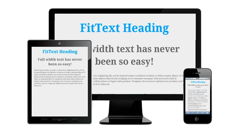
Multiple Screens Typography
Screens of different sizes present a unique challenge when designing typography as there are a number of things to consider.
The distance between the screen and the eyes of a reader is different on various devices. A larger screen is usually kept further away from the eyes which means that the font size must also be increased.
Another thing to consider is the proportion between the size of the body text and the rest of the elements.
Responsive Typography and How to Code It
As we already learned that we need to proportionately increase font size on larger devices, we need to set particular styles in our html like so:
body {font-size: 100%;}
@media (min-width: 40em) {font-size: 115%}
This will allow us to increase to base font-size on devices with a width of at least 40em. However, the math involved with ems is quite complex. That is why I recommend using rems. The way you can set the responsive typography with it is explained in length in this article.
So far you’ve learned what you should consider in your efforts the present users with a good typography for responsive web design. There is no reason why it should be difficult when you do it right. It is challenging to learn at first but your efforts will be rewarded when you continue building more and more projects for the web and people start appreciating what you have done.
