Graphic designers have many decisions to make when creating deliverables for their clients. In addition to balancing messaging and imagery, deciding on the right font to use can make or break a final product.
Photo 30368165 © Andreblais – Dreamstime.com
Fonts can be broken down into 5 major categories; Serif, Sans Serif, Slab, Script and Decorative. Each typeface brings its own underpinning characteristics, which can support (or dilute) the message you are trying to create when building your brand, delivering a marketing message or formulating an ecommerce strategy.
Serif
A Serif font will by definition have a small decorative line at the end of the character stroke. A classic example of a Serif font is Times New Roman or Cambria used by default when typing in Microsoft Word, for example.
Photo 5459010 © Firebrandphotography – Dreamstime.com
Serif fonts are classic, and their use implies class, literacy and high-end messaging. They are also highly readable which makes them perfect for blocks of text in books, brochures and fine print.
Sans Serif
The Sans in Sans Serif means “not”, as in they do not have the small decorative line at the end of each character. A classic example many will be familiar with is Arial (which is what you are reading now).
 Photo 90439604 © Yuryz – Dreamstime.com
Sans Serif fonts are modern and clean. They communicate strength and clarity. They also are chosen for easy readability with added benefits of working well in low resolution environments like websites and eReaders. Thick Sans Serif fonts represent masculinity and hard work; while thin lines appear glamorous and regal.
Slab Serif
Slab Serif fonts use a blocky effect for the decorative line on the character. They have the appearance of a good old fashion typewriter. A good example of Slab Serif is the Rockwell typeface.
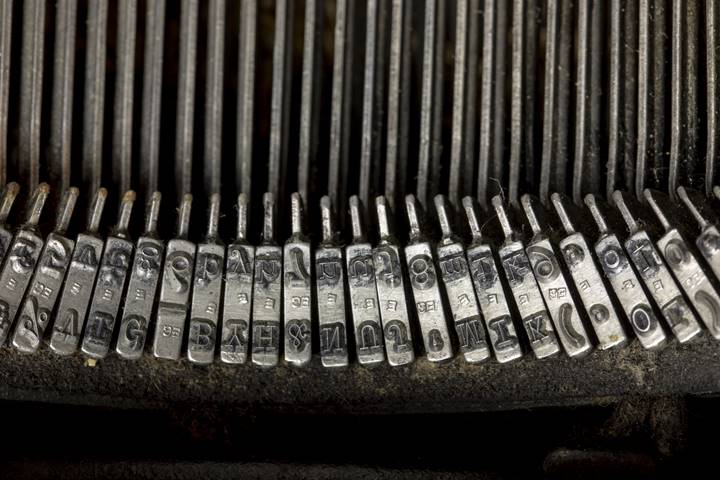
Slab Serif fonts bring an old-school, vintage, nerdy, retro feel to the text. While good for readability in logos and headers, this font can appear difficult in extended blocks of text.
Script
Script fonts have a handwritten cursive style. A good example is the Brush Script font.
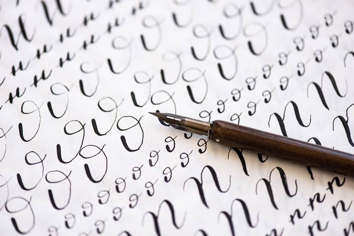
Photo 178184019 © Olga Akinina – Dreamstime.com
Script fonts can convey a wide range of underlining messages. High-end calligraphic styles represent formality and tradition and are therefore used a lot for wedding invitations; while the low end grunge scribble looks more like an artsy and modern scrawl. Overall, they have a more feminine feel. Script fonts can be very difficult to read, especially in small text, so use judiciously for effects but avoid for the fine print.
Decorative
Decorative fonts are those highly stylized, creative typeface which can be either powerful in communicating your message, or make you appear amateurish and comical. Decorative fonts are best when used by trained professionals who know how to walk that fine line – but when used correctly they can create a powerful brand identity.
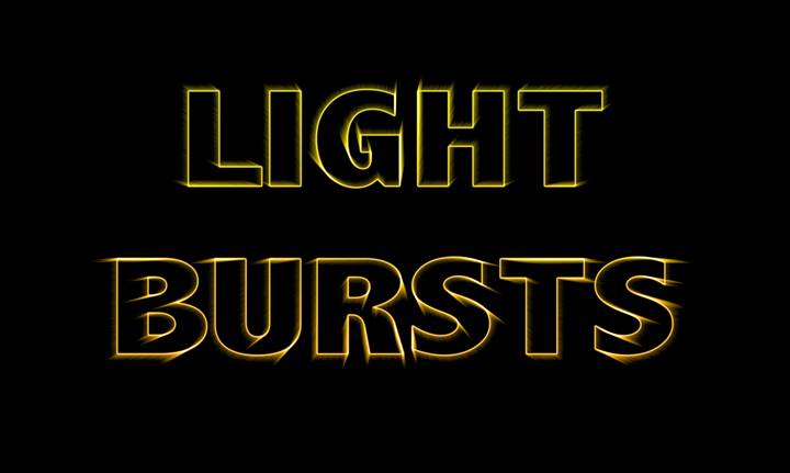
Illustration 121221428 © Karen Foley – Dreamstime.com
One important thing to consider when choosing your fonts is to choose something that will stay relevant over time. An outdated font in branding material can make the overall message look too dated too quickly.