It’s time-consuming to cut through the ocean of mediocre web fonts to find the real gems that punch above their (zero) price tag. With this in mind, we’ve rounded up the greatest free web fonts from around the web to get you started.
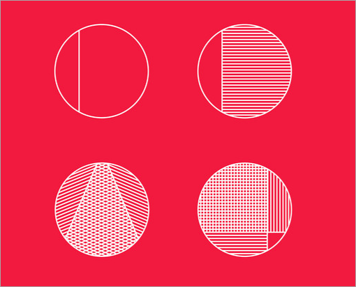
Typometry
An experimental display typeface inspired by geometrical forms. An interesting choice for unique patterns or just playing arond with glyphs. Designed by Emil Kozole. An advanced version of the typeface with 2 weights, 4 styles and 220 glyphs is available as well.
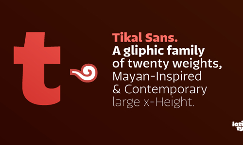
Tikal Sans Medium
Tikal Sans is a family with curved terminating strokes, ending in sharp edges. With a contemporary feel, a tall x-height and OpenType contextual alternate letters, Tikal Sans offers a functional look with a friendly touch. The thin and black weights are great for display sizes, while the light, regular and medium weights are well suited to longer texts. Tikal Sans Medium and Tikal Sans Medium Italic are available for free, but registration is required.
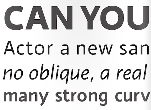
Actor
If you are looking for a workhorse typeface, then Actor might be it. It has a tall x-height, which is why it requires fairly high line spacing. The digits of Actor are created as old-style figures. The font can be used for free via Google Web Fonts.
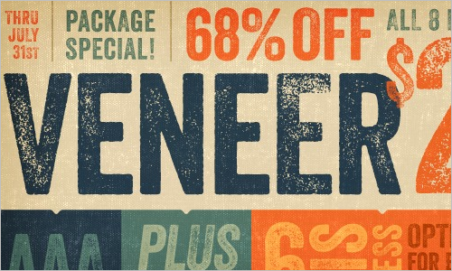
Veneer Extras and Veneer Extras Italic
Veneer is a versatile, handcrafted “letterpress” font that has an authentic vintage feel with a touch of grunge. The freely available extras include 70 glyphs, in both regular and italics. Registration is required for the free download.
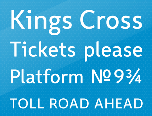
Wayfinding Sans
This type family, designed by Ralf Herrmann, sets a new standard for legibility in signage and wayfinding. Herrmann started this project with extensive field studies, driving tens of thousands of miles to explore the legibilty of road signage typefaces in dozens of countries around the world. The results of these explorations, along with an extensive study of relevant scientific legibilty research, formed the theoretical framework for creating an “ultimate” signage typeface. Wayfinding Sans includes 400 glyphs in one style, with arrows. To get the font, a tweet or Facebook update is required.
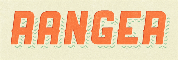
Ranger
Here is a playful Colorado-inspired italic typeface, designed by Evan Huwa. It’s a good choice for a bold movie title or a vintage book style. This typeface is sans serif and uppercase only.
Plastic Type
The designers of this typeface were inspired by the plastics industry, exploring how they could use the various forms and imperfections of plastic in their design. The result of their experimentation is a freely available, beautiful, playful font, released under the Creative Commons Attribution Share Alike license.
Corki
Corki is a distinctive condensed slab-serif typeface suitable for headlines. Four styles are available: Regular, Rounded, Tuscan and Rounded Tuscan. The typeface includes 134 glyphs: both Latin and Cyrillic scripts, plus two manicules and various arrows. It is available for free.
Bariol
Bariol is a friendly, rounded, slightly condensed typeface, available in four weights and designed with versatility and readability in mind. It’s nice and familiar, without being too sweet, and very readable even at small sizes. Bariol Regular is available for free (a tweet or Facebook update is requested), but each font weight can be purchased for just $1.00.
Alegreya
This beautifully designed serif typeface has a classic, olden feel. The uppercase letterforms seem to be based on Roman script, while the lowercase characters rather have the feel of a humanist book. The family consists of 12 fonts (including regular, italic, bold, black, bold italic and black italic.)
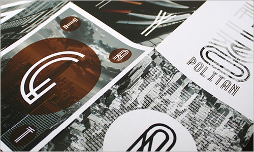
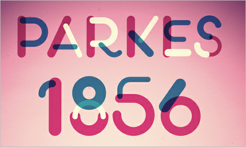
Metropolis
Metropolis is a distinctive, experimental typeface in the Art Deco style. The design was inspired by the industrial movement of the 1920s, when skyscrapers where born. As the designer explains, “Using a double line technique, I wanted to create my own Art Deco style font that represented this era. The result is a bold, bumptious typeface with a stolidly calm disposition.” Metropolis could be a good choice when you are looking for a retro or retro-futuristic look. Released under Fontfabric’s Free Font EULA, you may use it in your private and commercial projects for free, but if you use it with a @font-face declaration, then a credit to Fontfabric is required somewhere on your website.