
There are many factors to recognize when striving to create the best possible user experience. Finding the right web font is important but is not the one thing that determines how text displays on a range of devices or how well it will sit on a page.

Go Through the Content
The content is the single most important factor to be observed when striving to create meaningful typography. If the content isn’t available before you start putting together the design, try to find and read similar texts related to the website you’re building. If the website is about web development, read texts on this subject prior to creating the typography of the design. This way you not only discover important facts on the subject of your interest but also put yourself in the shoes of the reader.
Decide on a Typeface Most Suited for the Particular Content
If the content is about web development the font family should be modern, yet easy to read. Using Lorem Ipsum when the content for a project isn’t available yet is an option but it is always better to use instead dummy text related to the subject of your site found on other existing sites covering the subject or your interest. The typeface is an important part of evoking emotions and designing the atmosphere for the user. It also helps distinguish the brand from its competitors.
The Mobile-First Approach
Start from the smallest possible screen width to adapt the typography for mobile phones. It is always easier to start adapting your design for small width devices first and then increase the size of text and add more elements when additional space becomes available.
Make your choice on a line height and font size combination that best suits small devices. Then increase them as the device width increases. 16 pixels is a good starting point for mobile devices font size.
Transition to Larger Screens
Mobile-first approach is not a mobile-only one. Once your typography and design start looking good on mobile width screens, begin adapting them for larger devices. They are usually kept further from the reader’s eyes and require larger fonts to preserve readability. Consider enlarging your base font size from 16 to 18 pixels. At this point, considering an increase in line height is also a good choice.
Combine Typefaces
This is a common strategy to generate interest in a design. Although you shouldn’t use too many fonts, having at least two in your typography is recommended. Certain websites help you find the perfect font combinations, especially when you’ve already decided on one of the fonts. This helps improve the flow of reading.
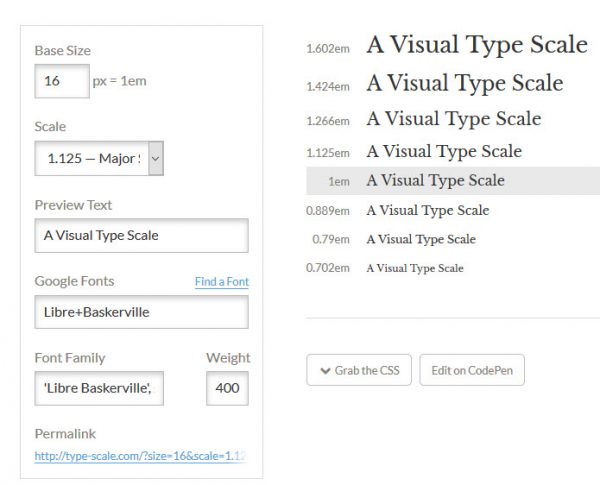
Consider a scale
If you are unsure on what font size to use for certain device width, you can always use a scale. One option for acquiring such a scale is to use the type tool of Jeremy Church available at type-scale.com. As it is the case with most such tools, it allows you to set up a base font and then scales it appropriately. It also allows you to download the CSS for use in your design’s stylesheet.
Decide on a Grid
The grids determine the balance and positioning of elements in a layout. They help present content in an easy to understand order or highlight certain content by taking it out of the grid. The most common grid, the one that Bootstrap also uses, is the 12 column grid.
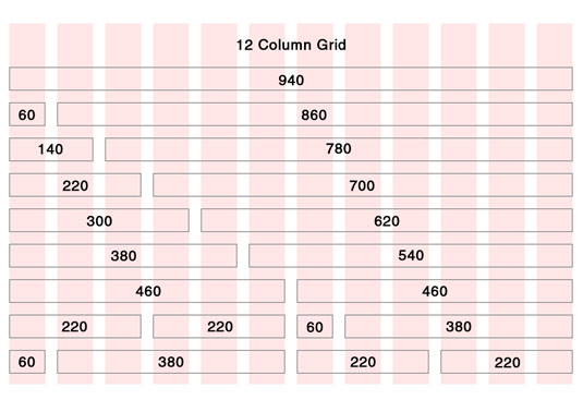
The grid is just one tool for putting together your layouts and it is not obligatory to use it at all. Some of the most successful designers break the rules imposed by the grid layout. However, they all know how to use it.
Your typography should also account for the various other design elements – lists, titles, comments, captions and so on, and style them appropriately. The grid simply adds meaning and structure behind placing them in your design.
When creating typography for everyone, we should take into account everything. We shouldn’t forget that our designs will be accessed from a range of devices with different width. Ensure that your typography looks equally well on a limitless range of devices.