

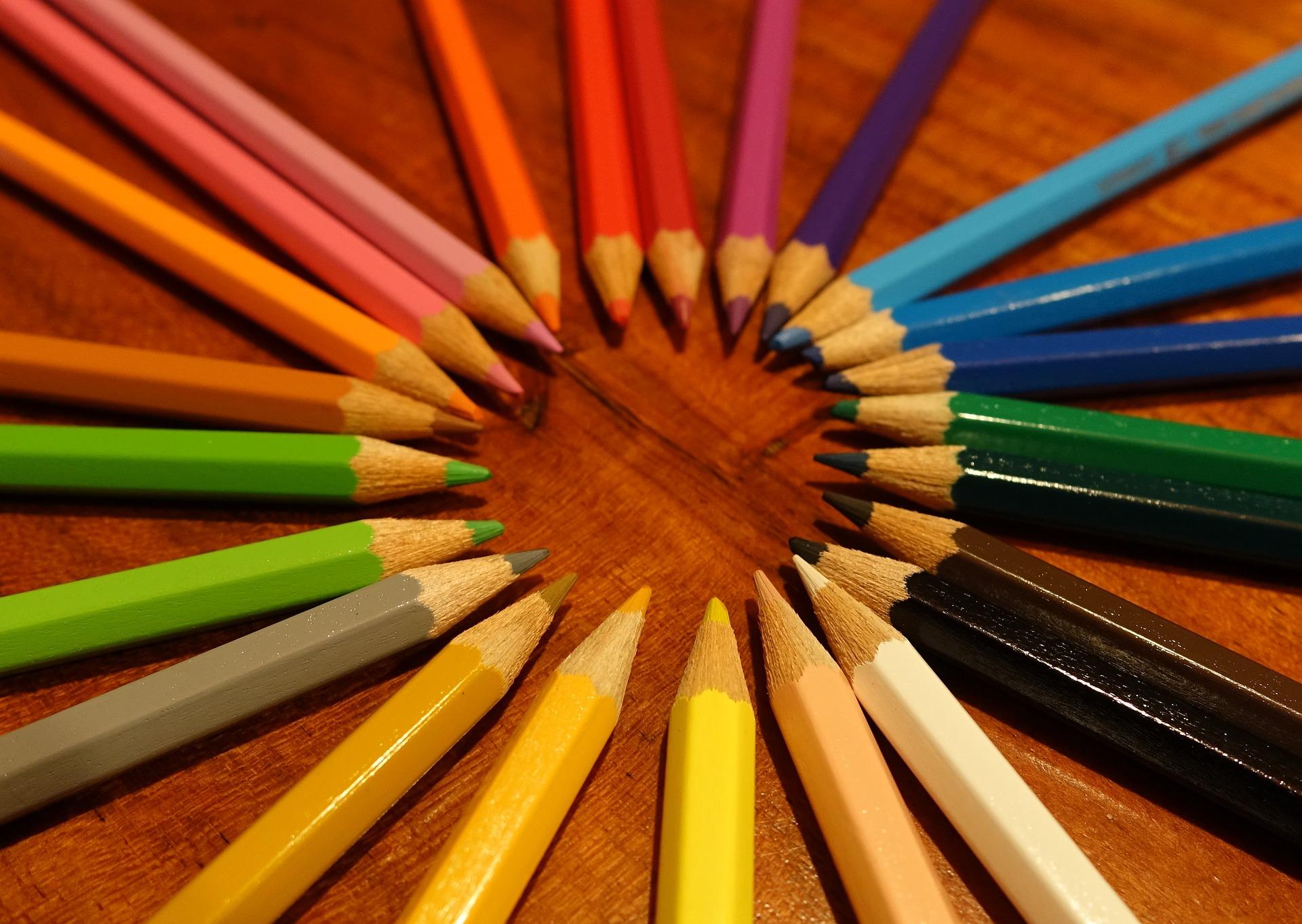
Colour is an important part of our lives as it is one of the most exciting stimuli we get to experience via our eyes. Not only is colour attention grabbing, but certain colours stir particular emotions; a phenomenon that can be used to anyone’s advantage to convey the right emotions. Brands use colour to define their persona and identity, and stir the emotions they want to be associated with their product. In web design, colour is used to both grab and direct attention, as well as help demonstrate the order of the design elements on any given web page, making it a huge determinant of the quality and nature of user engagement.
Other than colour, other factors that affect user engagement include good UX (user experience) and properly written content, particularly targeted CTA wording. You may think of colour as the cherry on the cake, which helps all the other elements make complete sense and work most effectively. The goal of a website is usually to encourage users to complete a particular action and raise the number of conversions by carefully guiding them through a journey to the desired end point. This means users must be able to figure out the navigation of a website easily, follow the story of the page, and find the right places to click to achieve the desired action without hassle. A thorough understanding of the psychology of colour can make all the difference in designing pages that convert better.
What is colour psychology?
Colour psychology is a science and branch of behavioural psychology that is concerned with the kind of effect colour has on human behaviour. There have been numerous studies on colour and research into how colour affects human behaviour continues. While there is not always scientific evidence to back up every claim made about colours and their effects, there is no denying the effect they have on people and the connotations particular colours take on.
To prove just how heavy a role colour plays, Satyendra Singh wrote in a peer reviewed journal article that it only takes a minute and a half for a consumer to decide how they feel about a product, and 62 to 90 percent of the interaction depends solely on the colour of the product. In web design, the psychology of colour helps designers predict how visitors will respond to each design element on a web page.
How colour can be used to influence user engagement
● User interaction
Colour can be used to show a user how they are supposed to interact with a given experience and particular elements on a page. Particular colours are better used for error messages and alert indications, as well as other such visual elements. The same applies to multi-step indicators, links, tabs, breadcrumbs, and button states.
● Guiding eye flow
Contrast refers to a measure of variation between different colours, and those on the opposite ends of the colour wheel give the highest level of contrast. When contrast is introduced between the background, text, and buttons, the user’s eye seamlessly moves all around the page. Web pages designed with properly executed colour contrast are able to draw the user’s eye to the most important elements on a web page more easily than web pages which have not.
It is important to check that the colours have enough contrast to make the text legible and for the CTAs to stand out to users. The modern minimalistic trend that has been popular in not only web design but other design spaces as well, uses white backgrounds and subtle dashes of colour to draw the user to certain elements on a given web page.
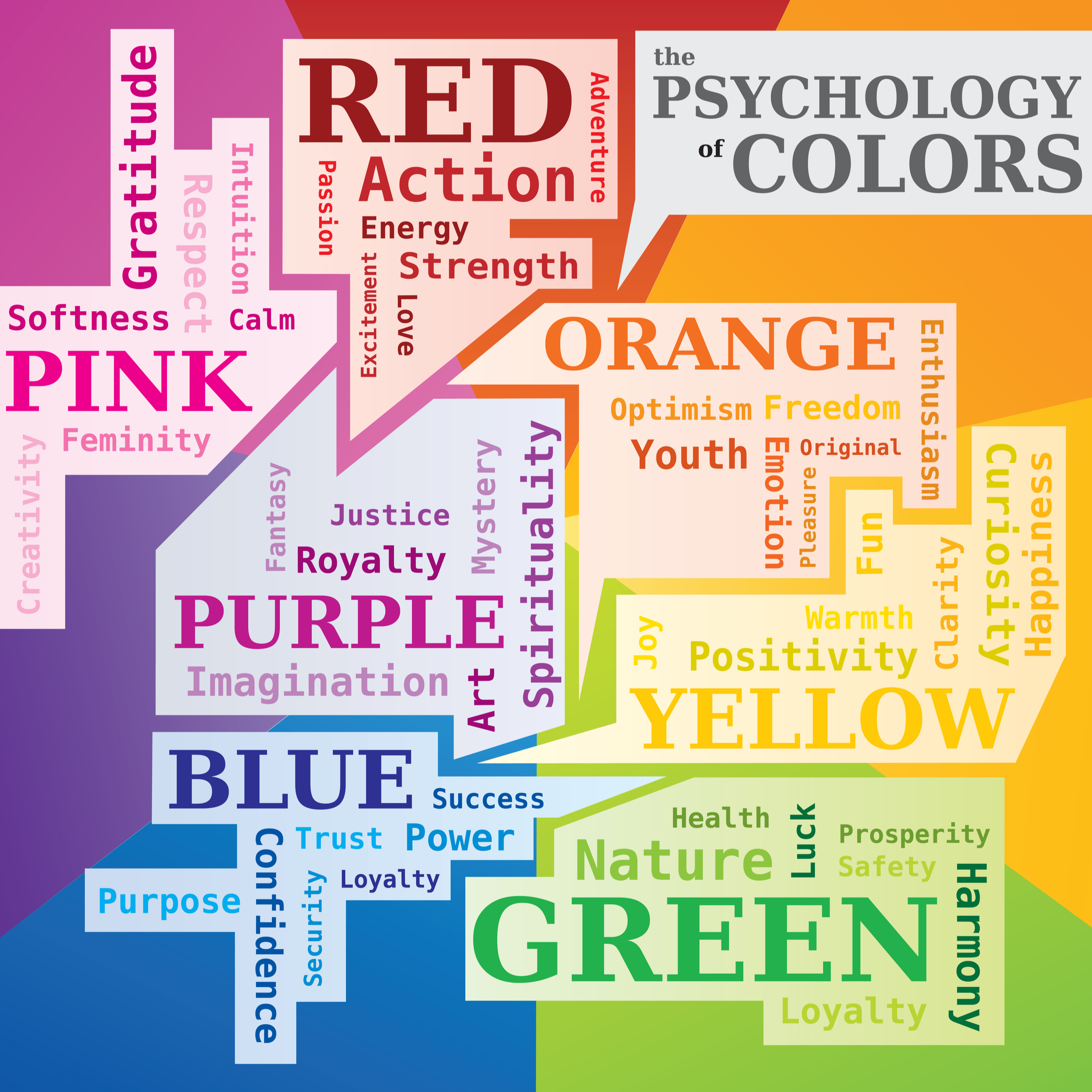
The language of colours
There is so much to say about colours and the kind of emotions they elicit or connotations they suggest. For example, white communicates clean and minimal, black says modern and sophisticated, while purple or violet seems to say luxurious and enigmatic. A little time dedicated to understanding the effect each colour has will help any designer create websites that achieve much more.
“There is more to colour than the mood each colour is believed to convey,” says Brendan Wilde, Marketing Manager at New Zealand’s offsite cloud backup company. “The colour scheme that would be selected for a website will also depend on the demographics of the target audience and not on the brand identity alone. Factors such as age and gender matter a great deal. For instance, a website for a children’s theme park might use bright shades of red, yellow, and green.”
When it comes to gender, a lot has been said regarding which colours work better for men and women, based on research:
● Women
Women are said to like green, purple, and blue, while they dislike brown, orange, and grey. Many websites who have women are their target consumers typically use primary colours with tints and avoid earthy tones. By now, you might be wondering “how about pink, isn’t that women’s favourite colour?” The answer is no, it’s not. Pink suggesting femininity and pink being a favourite colour are two entirely different concepts. In fact, more women prefer blue, which is considered a masculine colour. It is to avoid making assumptions like this that it is important to have a proper understanding of colour.
● Men
Men like black, green, and blue, while they dislike brown, orange, and purple. While brown is commonly associated with maleness, it clearly isn’t a favourite and should be avoided in a website selling products specifically to men.
Testing before settling for colours
Because generally accepted conventions cannot be relied upon when deciding the colour combinations to use for a website, it is not only important to research and learn the effects of each colour, but also to do some testing of your own. Consumer behaviour can be unpredictable sometimes and to stay ahead of the game, A/B testing should be adopted and utilised often.


[…] the way the menus look. You should definitely think about the color scheme because there are some great things that can be done by changing the color scheme […]