Web design inspirational galleries are filled with well designed websites and by looking at what the moderators have curated you might think that we are on a good path here and the web design environment is evolving beautifully.
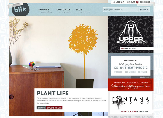
Blik
Blik manufactures whimsical removable graphics to spice up the walls of your home. Even though the “About” info gets a bit lost in the large product preview in the center, getting an idea of what Blik is all about doesn’t take longer than a couple of seconds. Aside from the stylish look, the easy shopping experience is what makes this design exquisite.
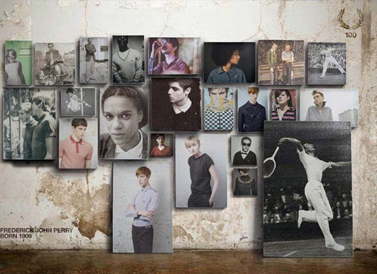
Fred Perry
Fred Perry’s e-commerce store has a contemporary and elegant look, conveying key features of the brand very well. The stylish grayscale color scheme, along with sparse text in Helvetica font, make an impact. The design naturally combines Flash and JavaScript. The mini-cart window, the readable layout of the shopping cart and checkout pages, the usable navigation and informative product descriptions all up to a slick and friendly shopping experience.
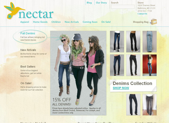
Nectar
The website for clothing and accessories boutique Nectar was designed bySunrise Design studio. The website’s structure allows you to browse goods and make purchases with ease. A muted palette and slipshod watercolor strokes in the background give the layout a positive feel. By the way, if you visit the designers’ portfolio page, you’ll see that painted styles must be their passion.
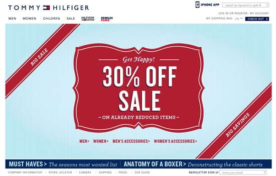
Tommy Hilfiger
Another giant brand: Tommy Hilfiger. This design relies on simplicity, a comfortable shopping experience and its corporate identity.
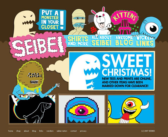
Seibei
Now, that’s a design you will not forget! The site has a very simple, even minimal navigation combined with a striking “cartoonish” design. Product pages are clean and straightforward. Nice and unique design solution.
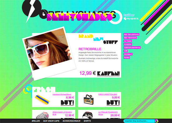
Bellyshades
The design of German club-wear and accessories store Bellyshades stands out for sure. The vibrant acid colors, insane typography and animals that stand in for shopping carts will leave you anything but cold.
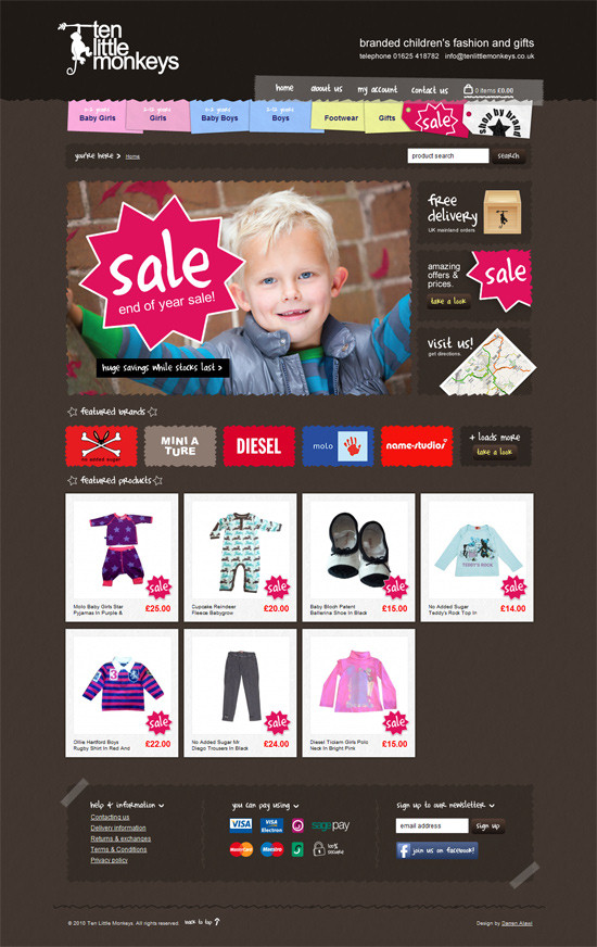
Ten Little Monkeys
This design has a very strong visual appeal; vibrant colors work well on the dark background, the navigation is colorful yet intuitive (notice how the section for girls and boys are distinguished). Also, the choice of typography is appropriate for the shop’s main objective: selling branded children’s fashion and gifts.
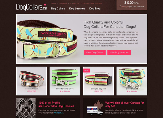
DogCollars.ca
Here’s another beautiful e-commerce website: DogCollars.ca. It’s a simple HTML website with a neat grid-based layout, a warm chocolate color and big high-quality thumbnails. The design is minimalist but not plain, and it delivers a satisfying shopping experience.
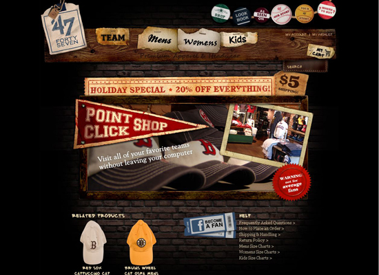
’47
Premium sports apparel brand ’47 has an interesting history: “This is a classic story. It’s the American dream come to life…” Thus, the company emphasizes the individuality of its brand in its store design and associates that brand with a community. The website combines jQuery and Flash, which slows the loading speed, but given its objective, this is not critical. Creative visualization and a well-implemented shopping mechanism make for a wonderful e-commerce design.
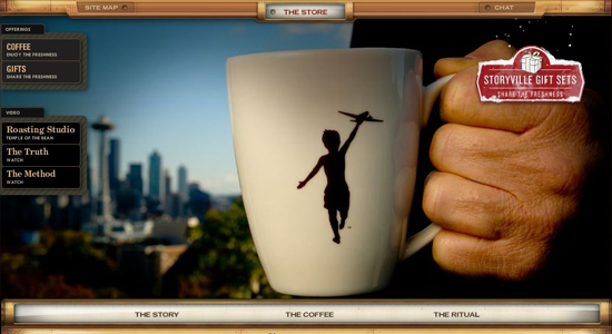
Storyville Coffee Company
Creating an e-commerce Flash platform, let alone a good one, is challenging. In addition to the Converse store profiled above, our showcase includes another fully Flash-based online store: Storyville Coffee Company. This one sports a pleasant coffee theme (appropriately enough), an original table-like product viewing area and an easy shopping process.
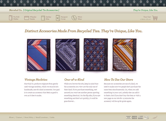
Narwhal Co.
Accessories made from recycled ties? Yes! Narwhal Co. produces original jazzy merchandise from recycled ties, including wallets, wrist wear, covers and cases. The tie theme in the website’s header and footer, the stylish icons and the inventive product slideshow on the main page give this design a special flavor.
The Famous 4th Street Cookie
Beautiful typography and high-quality images make this a tasty design.

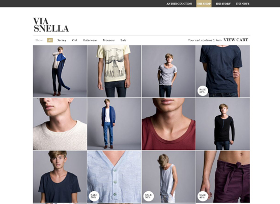
Via Snella
The website of Swedish male fashion brand Via Snella is clean both in design and usability. The store itself is not very big, so the product gallery is not cluttered with the superfluous navigation bars, announcements and slideshows that are typical of large comprehensive online stores. Instead, the background of the fancy product thumbnail grid is made up of a classic black and white scheme, along with austere typography and plenty of white space.
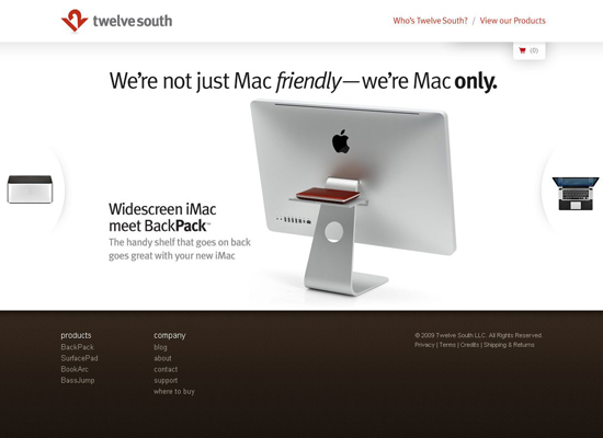
Twelve South
Twelve South creates accessories exclusively for Apple computers. No wonder Apple’s style can be felt both visually and in the functionality, which is a compliment enough to Twelve South’s store design.