
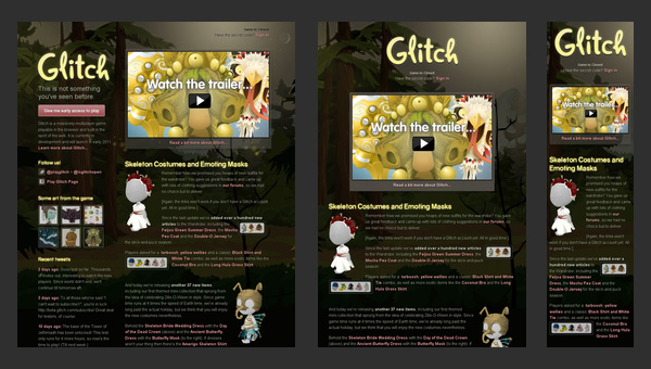
Glitch
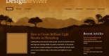
At the present time the website is closed. The home page includes some information about the previous project activity, helpful links and characteristic illustrations. This is only one static web page that is reminiscent of the old days.
dConstruct
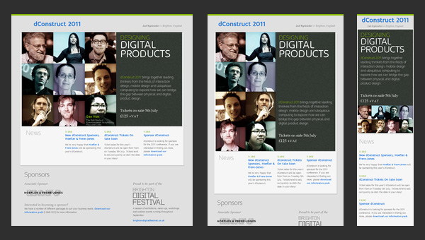
dConstruct is a website dedicated to conference and workshops that take a look at perceptions of technology and culture. Though the design is quite primitive, yet the informative side is really well-thought-out. Thus, the front page draws your attention to only 3 main moments
Adaptive Web Design
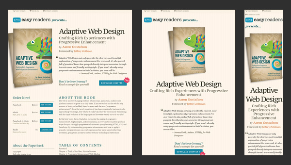
As the nameplate implies, the website is concentrated on adaptive issues. To be more precise, this is a promotional website that advertises a book that will answer all you questions.
Authentic Jobs
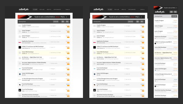
Authentic Jobs is an online directory that is aimed to unite employers with job seekers. It traditionally displays data via a list-style layout that is quite elegant and easy to handle when it comes to adding versatility via incorporating responsive behavior.
Five Simple Steps
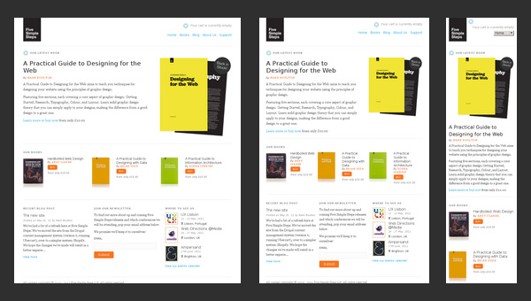
The website of Five Simple Steps has a clean appearance that features only some kind of valedictory speech and a list of helpful stuff from those who previously run this website.
Splendid
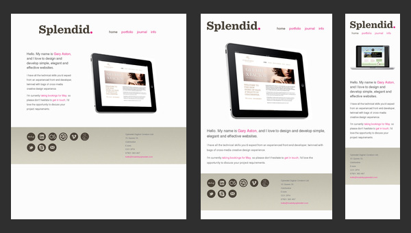
Splendid is a simple online portfolio that emphasizes users’ attention on artist skills and experience. You will not find neither fantastic illustrations nor ingenious effects; the designer takes a minimal approach in order to present himself, and it definitely stands in a stark contrast to other sophisticated creatives’ websites.
Ryan O’Rourke
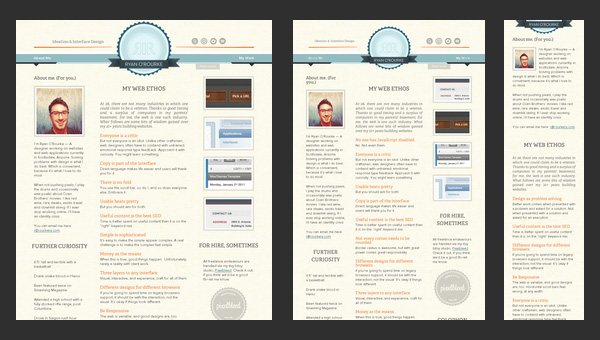
When you run into online portfolio of Ryan O’Rourke, it seems that the designer is guided by the wise phrase “brevity the soul of wit” and realizes it literally. Minimalism, minimalism and again minimalism…there is only one web page that features one sentence, email and small gif animation that shows off his activity. However much like the previous example, the website is based on a responsive framework that makes the website ready for mobile web audience.
FlexSlider
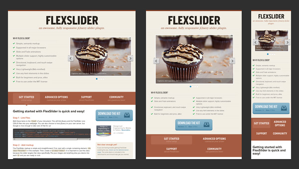
FlexSlider is a lightweight jQuery slider from WooThemes with simple semantic markup and numerous valuable features that was created to become your reliable companion for an ideal image showcase on every popular device.
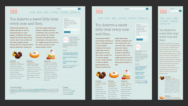
El Sendero del Cacao
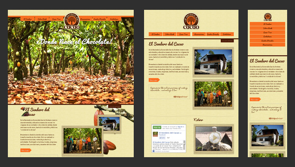
El Sendero del Cacao has a visually-appealing website with a calm and warm atmosphere that is achieved with a help of soft coloring, spectacular images and appropriate graphics. Moreover, thanks to such integral features as
Do Lectures
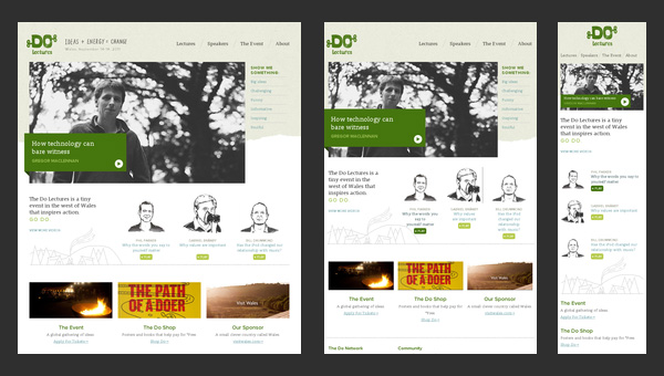
Do Lectures is a regular blog that makes use of a 3-column format layout that effectively copes with lots of news and posts populated with images. The website has an old-timey feeling because of its conventional markup and lack of any dynamic elements.
St Paul’s School
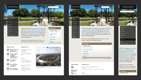
Nowadays, a great deal of educational institutions has their own websites. Even the official page of the St Paul’s School is not lagging behind others, having a website with
Naomi Atkinson Design
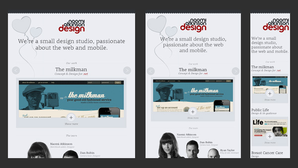
Naomi Atkinson Design is a small passionate UK-based design studio that has a tightly-packed together website. The team employs a boxed-style layout with centered content diluted with minimalism that is aimed to:
Ben Handzo Photography
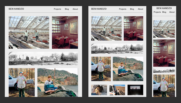
After casting a mere glance at the website, it becomes clear that the artist is simply obsessed with photos. The home page of his online portfolio is packed with images; there is absolutely no text, with the exception of navigation and small panel placed on footer.
Stunning CSS3 Media Queries Example
As you have already noticed this is another website in our collection that is dedicated to responsive solutions called media queries that are highly popular among developers nowadays.