
Most professionals agree: 2013 is the year of Responsive Design in Web Design. Responsive Design is the practice of building a single website that is optimized for screens of all sizes: smartphones, tablets, laptops and large desktop monitors. Unlike the traditional approach of building multiple versions of the same website (a desktop version, a mobile version, etc.), responsive websites automatically adapt to screen size and to the capabilities of a mobile device. The benefit of responsive design is clear: only one website to build and maintain.
Simon Collison
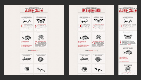
Though nowadays this greyish grid-style static website looks a bit boring and dull, however when it was released it caused some kind of furor with its high-end layout.
Andersson-Wise Architects
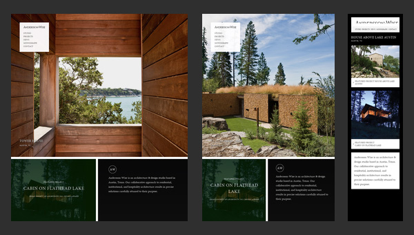
Being dedicated to an architecture and design studio it doesn’t surprising that the main focus of the website are photos that showily represent skills, experience and clients of the company.
Stephen Caver
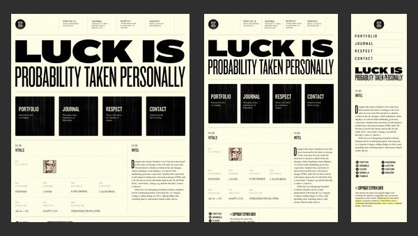
Stephen Caver has a topnotch website when it comes to responsiveness. You will definitely ask, what so special in it. The answer is simple, take a closer look at the front page and you will see; it consists of
Sparkbox
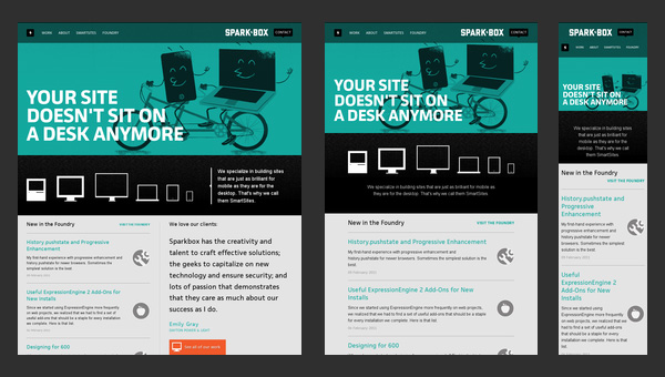
Sparkbox demonstrates a basic structure of a corporate website. The layout is pretty simple; it is based on a standard, commonly-used set of horizontal stripes that present data in a non-intrusive manner. Such structure is really easy to adapt to various screen sizes. The sequential arrangement of blocks deprived of embellishments undergoes changes quite smoothly and effortlessly, giving users a nice-looking and well-organized layout.
Food Sense
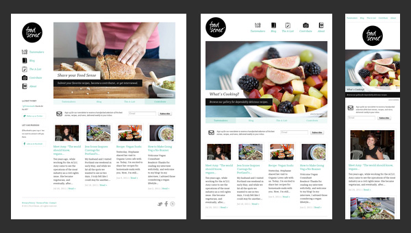
Transformation from a regular left-sided blog-style magazine layout populated with numerous yummy pictures to an elementary block-by-block layout – here is how the main process of adaptation looks like in this website.
However, there is nothing supernatural; it is believed to be a typical solution to a great deal of projects that want to attract online readers from mobile web, win over new audience, and at the same time, save the website’s aesthetics from a visual overload.
The Boston Globe
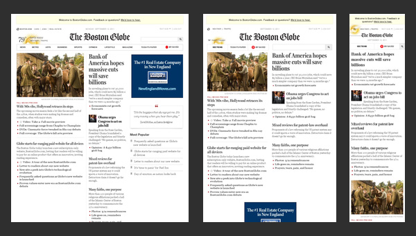
The Boston Globe is an excellent example of a well-thought-out news-related website that is based on a responsive layout. The website takes on a conventional approach that is helpful for those who are eager to run its own frequently updated online magazine.
Think Vitamin
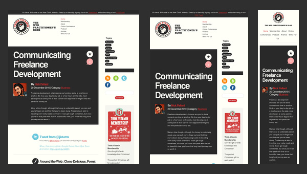
To be honest, Think Vitamin can’t boast of anything particular concerning its blog design. It has the same markup as everyone else’s. It has 1 main column with a right-sided widgetized sidebar, a header populated with navigation, a logotype and a search bar, and a footer that presents information via set of blocks.
Sasquatch! Music Festival
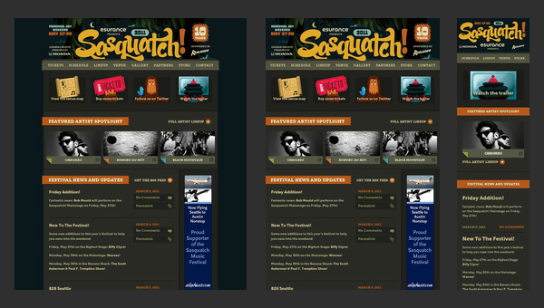
Sasquatch! Music Festival has to deal with a lot of multimedia content including videos and dynamic effects that in addition is spiced up with some artistic hand-written lettering and fantastic graphics. So for the team, it is quite a challenge to display everything correctly on mobiles and tablets.
Internet Images
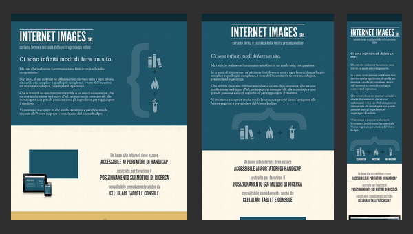
This is another clean well-organized website that is based on a flexible horizontal stripe layout. The responsiveness here is also effectively bolstered by a color differentiation that visually separates one logical block from another.
Staffanstorp
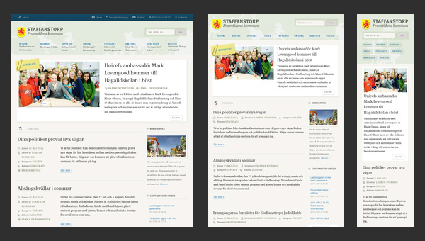
Here, an ability of a beautiful adaptation to smaller screens as well as to bigger ones brings such benefits as
Seminal Responsive Web Design Example
As the nameplate implies, the website serves as a perfect example of a responsive design. It even has a proper title “A Flexible Grid”, so it becomes clear that everything here is riding on rules of graceful degradation. As expected, the team pays more attention to an ideal data presentation rather than to aesthetics, so styling goes into the shadows.
Naomi Atkinson
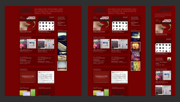
Naomi Atkinson leverages a mosaic-style layout for the front page. This solution is widely-used among those who want to immediately shed a light upon its artworks by creating online portfolios.
Forefathers Group
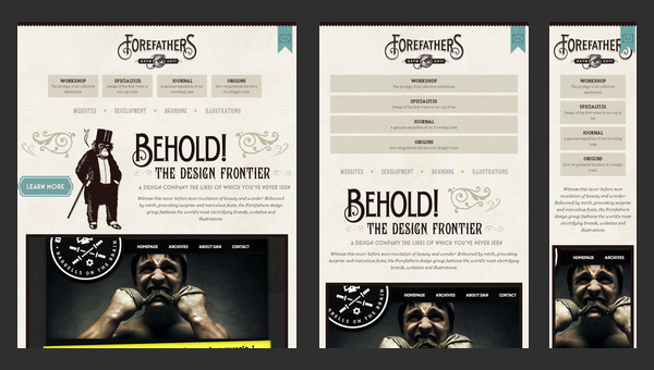
What can you say about this website? It certainly conveys a distinct, quite overwhelming impression with its matchless, sophisticated design. The team has not stinted on the artistry that manifests itself in various moments.
Spigot Design
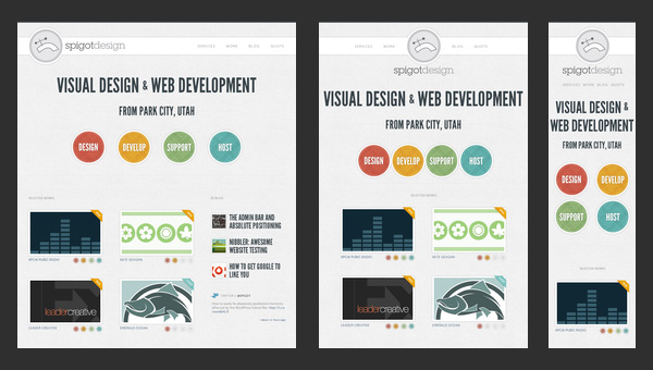
Here, the responsive behavior should leave an imprint not only on a standard layout that includes grid-style and line-by-line data presentation but also on intro video, dynamic graphics and of course, menu.