Logoed
Logoed is a blog that showcases beautiful logo designs. The single-page site has been around for over a decade and so has a great variety of logos in its archives. A clean and simple layout, thumbnails of each design are arranged vertically, requiring users to simply click on each for more information or scroll down the homepage to automatically load more projects.
Logospire
If you’re in search of inspiration, logo design gallery Logospire is a great place to start. With a simple grid web page layout and uncluttered UI, it’s really easy to navigate. Logospire lets the designs do all the talking, the only information with each, for the most part, being the designer’s details. With 12 projects per page and 14 pages to browse through you’re sure to find some inspirational images here.
Brand New
Brand New is a division of graphic design enterprise Under Consideration that provides opinions on corporate and brand identity work. So, if you’re looking to find a site that offers information on logo design trends and advice and showcases awesome logo designs, this is the place for you.
Creattica
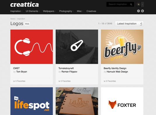
Creattica is a gallery of design and inspirational imagery. Although not dedicated specifically to logo design, the site still boasts an extensive library of over 3,000 projects in its logo category. Anyone can submit work for consideration, with the best work accepted and featured in the gallery. One of the best features of Creattica is the use of large thumbnails, which saves time clicking on each to see a larger version.
Logo of the day
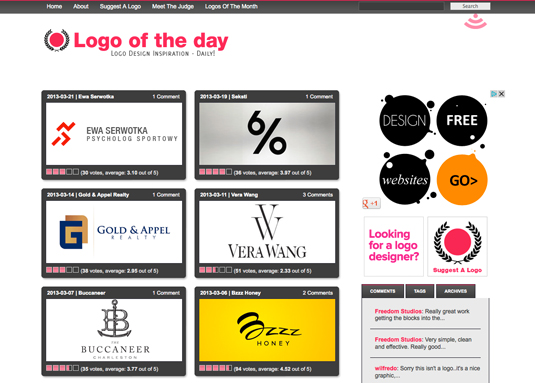
Launched in 2008, Logo of the day is a project by graphic designer Jacob Cass. The site features one brilliant logo design per day, suggested by the design community and chosen by Cass. Running for the last 5 years, Logo of the Day now has an extensive library of awesome logos to inspire you, all of which can be found archived on the Logo of the Month page.
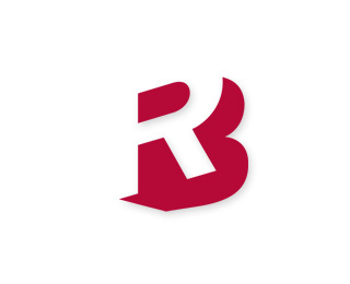
Bryan Kahrs use of negative space on the Ryan-Biggs logo gives a fantastic illusion of the letters B and R, initials of the targeted company while the slight angle adds depth and dimension to the design. All expressed in a single colour making the logo adaptable for a variety of uses and contexts.
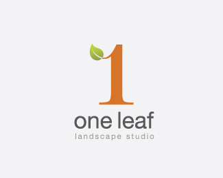
The One Leaf logo by Choerte combines imagery directly generated from the business name into a single graphical mark. The numeric version of the word ‘One’ is used as a tree to accommodate the simple leaf graphic. Both relate directly to the business name, as well as to the type of business. The two are also combined perfectly giving a nice smooth flow.
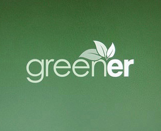
The Greener logo by Tanner Christensen gives a modern impression with varying weights of sans-serif type, but also adds the impression of multiple layers without risking the logo’s ability to be reproduced in a single color (always an essential aspect of good logo design).
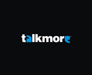
A fine logo design for talkmore uses symbology in the form of quotation marks to replace the letters A and E, creating a clever image that gives a graphical representation of the words and meaning of the brand. The touch of color enhances this effect making the logo stand out and adding to its attractiveness.
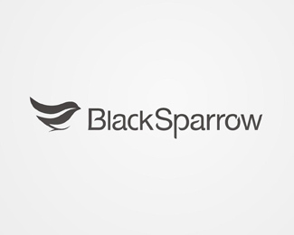
What first appears to be a simple design, the Black Sparrow logo from Alex Wende turns out to have some extremely high attention to detail. Everything from the bird icon to the type is tweaked with slight curves and flowing lines pulling together the complete design into a unique and effective branding statement.
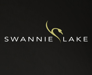
The Swannie Lake logo from Savera+Co blends the modern sans-serif typeface Avenir with a sleek graphical image than not only fits perfectly with the logo but also adds a subtle touch to the design.
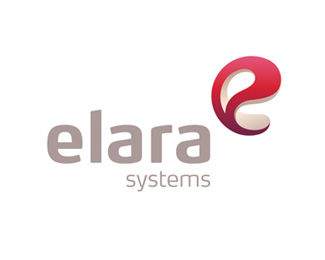
Using soft curves in the type and graphical device gives a friendly appearance to the Elara Systems logo by Maximalist. Bringing in the use of modern trends in the form of three dimensional effects to create a modeled letter E in the design fits perfectly with the animation and modeling studio this logo was created for.
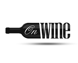
Perfect type choices and a superb idea from Piotr Chrobot give a sophisticated image for the Onwine logo, pulling together graphical imagery and type to produce a unique mark that brilliantly conveys the topic of the brand.
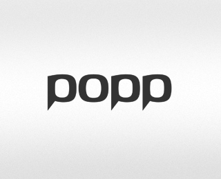
Vlastmil Svoboda’s design for the Popp logo takes the idea of basing a design on type to the next level by creating the complete word from the single base shape. The letter O can be seen repeated on every letter, with small tweaks made to the letter P to differentiate and give legibility to the word.