With the power of the Web, and more eyes watching than ever, it’s important for a business to communicate its unique message clearly.
1. Designed By An Amateur
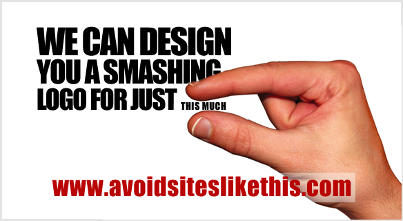
Avoid websites that promote ridiculously cheap logo packages. You get what you pay for.
A professional business should look professional. New business owners often invest a lot of time and money in property and equipment, but do not often match it by investing suitably in their logo.
2. Relies On Trends

Focusing on current logo trends is like putting a sell-by date on a logo.
Trends (whether swooshes, glows or bevels) come and go and ultimately turn into cliches. A well-designed logo should be timeless, and this can be achieved by ignoring the latest design tricks and gimmicks. The biggest cliche in logo design is the dreaded “corporate swoosh,” which is the ultimate way to play it safe. As a logo designer, your job is to create a unique identity for your client, so completely ignoring logo design trends is best.
3. Uses Raster Images
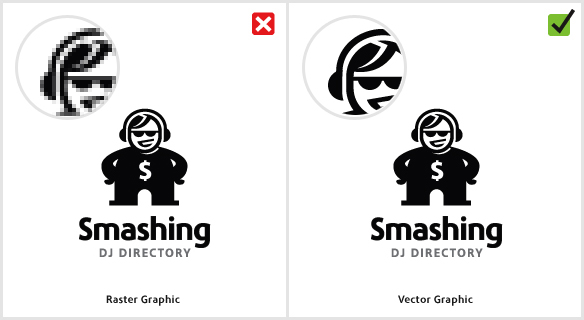
An example of how raster graphics can limit reproduction.
Standard practice when designing a logo is to use vector graphics software, such as Adobe Illustrator or Corel Draw. A vector graphic is made up of mathematically precise points, which ensures visual consistency across multiple sizes. The alternative, of course, is use to raster graphics software, such as Adobe Photoshop. A raster graphic — or bitmap, as it’s commonly called — consists of pixels.
4. Contains Stock Art
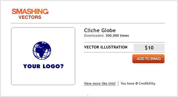
Using stock vector graphics in a logo puts your client at risk.
This mistake is often made by business owners who design their own logo or by amateur designers who are not clued in to the laws on copyright. Downloading stock vector imagery from websites such as VectorStock is not a crime, but it could possibly get you in trouble if you incorporate it in a logo.
5. Designing For Yourself Rather Than The Client

Never impose your own personality onto a client’s work.
You can often spot this logo design sin a mile away; the cause is usually a designer’s enormous ego. If you have found a cool new font that you can’t wait to use in a design, well… don’t. Ask yourself if that font is truly appropriate for the business you’re designing for? For example, a great modern typographic font that you just love is not likely suited to a serious business such as a lawyer’s office.
6. Overly Complex
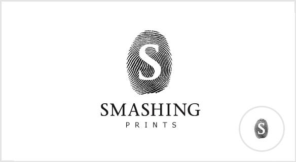
Highly detailed designs don’t scale well when printed or viewed in smaller sizes.
What better analogy for thumbnail images than fingerprints? You’ll notice the intricacies of your fingerprints only when looking at them really close up. As soon as you move away, those details are lost. The same holds true for highly detailed logo designs.
7. Relies On Color For Its Effect
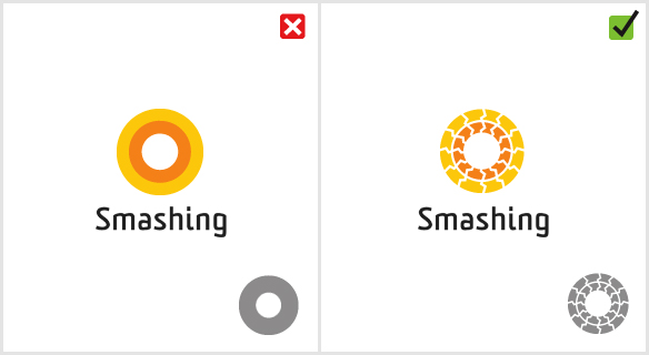
Without color, your great design may lose its identity.
This is a very common mistake. Some designers cannot wait to add color to a design, and some rely on it completely. Choosing color should be your last decision, so starting your work in black and white is best.
8. Poor Choice Of Font
Font choice can make or break a logo.
When it comes to executing a logo, choosing the right font is the most important decision a designer can make. More often than not, a logo fails because of a poor font choice (our example shows the infamous Comic Sans).
9. Has Too Many Fonts
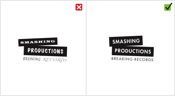
A logo works best with a maximum of two fonts.
Using too many fonts is like trying to show someone a whole photo album at once. Each typeface is different, and the viewer needs time to recognize it. Seeing too many at once causes confusion.