Design can be considered a craftsmanship because you do it until you are good at it and then you keep doing it to be better. The problem is that many developers are really eager to solve functionality problems rather than spending time to solve the interface issues.
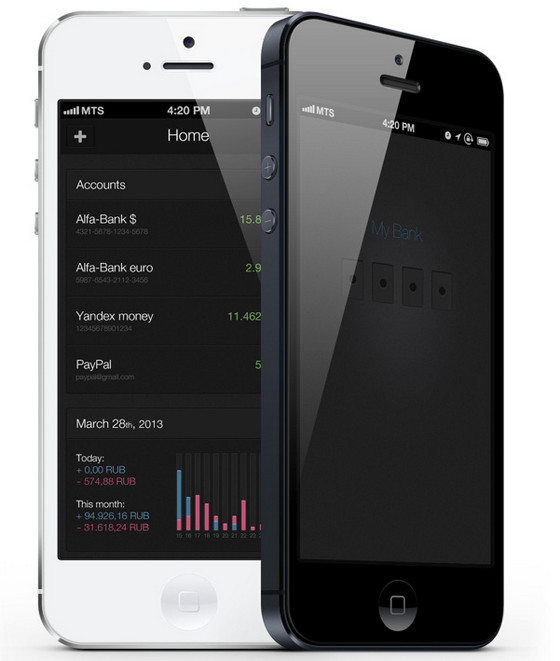
MyBank by Dis Bazgutdinov is another sophisticated app that helps to interact with your bank account. Unlike the previous example, this app has a strong and serious businesslike atmosphere mainly due to its interface that is based on a dark background and subdued coloring.
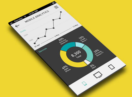
Analytics App by eyal zuri is an ambitious concept that includes several graphical instruments to display data. The designer plays on a contrast in order to naturally differentiate one functional block from another.
Fairshare Web App by Simon Phillips has a bright and cheerful UI that is imbued with elegance and positive emotions. Light background fits quite well with motley bar chart made in a nifty flat style.
Some new features for Mr Mood by 1Button. The app is aimed to keep up your spirits that is why it has a bright and energetic interface with lovely smiles. It also provides an owner with a couple of data visualization tools such as a jolly vibrant bar chart that takes up the whole space.
Tally Up by Adam Becker is marked by an exquisite gradient background that makes every foreground element to pop up. An ultra-narrow font in conjunction with a subtle line chart ably enhances beauty of a design.
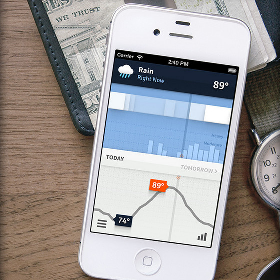
Weathertron by Ryan Lucas. Although the app is expected to familiarize users with weather forecast, it has a rather strong analytic atmosphere. An interface demonstrates data – that is statistically aggregated and weighted – by means of various sleek charts.
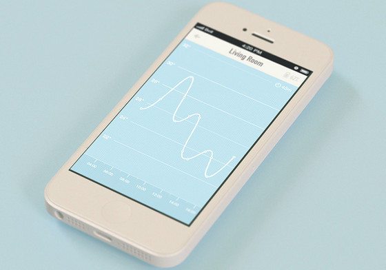
Temperature Screen by UNKL is also based on a scanty coloring and overall minimal approach. Skillful combination of regular white and gentle blue gives the app a delicate feeling while a tiny graph leaves a lot of room and air.
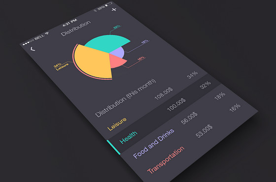
App by Wiktor Nowak allows tracking your expenses, visually demonstrating key aspects with a help of a huge colorful pie chart that occupies most of the screen.
![]()
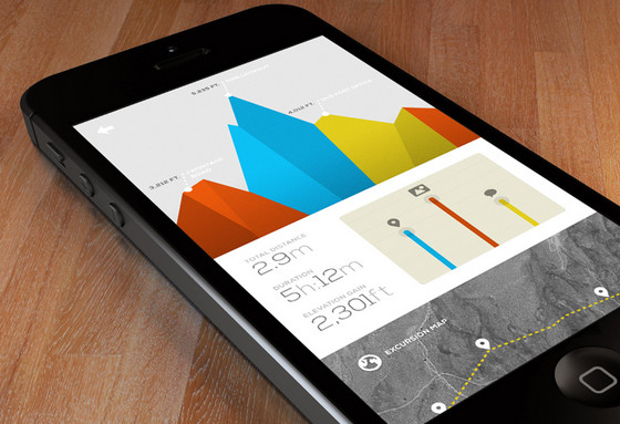
Excursion Stats by Marcus Edvalson – The app efficiently demonstrates statistics by means of a garish coloring that easily stands out from a clean grey background, area chart with a polygonal touch that brings a lovely 3-dimensional appeal, and crisp typography that accurately sets figures apart.
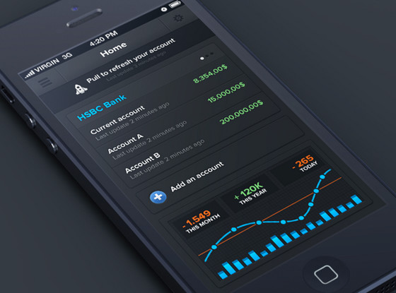
Banking iPhone app by Anthony Aubertin is supposed to showcase statistics about your money. The designer wonderfully matches sleek dark background with gaudy colors that aimed to neatly emphasize figures. A contrasting blue-tone immediately draws the eye to graph on the bottom.
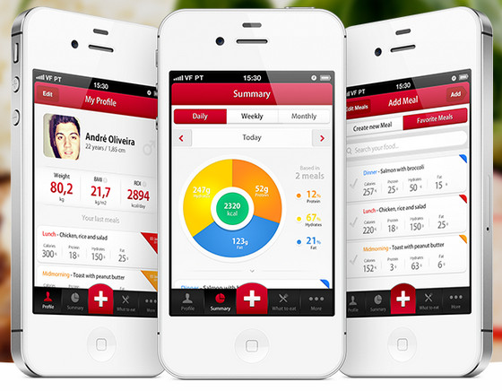
My Diet Diary by André Oliveira has a definitely optimistic vibe despite of being diet-related and using red as a core color. Such an optimistic atmosphere is mainly achieved by kaleidoscope of bright colors that are placed on a light clean background.
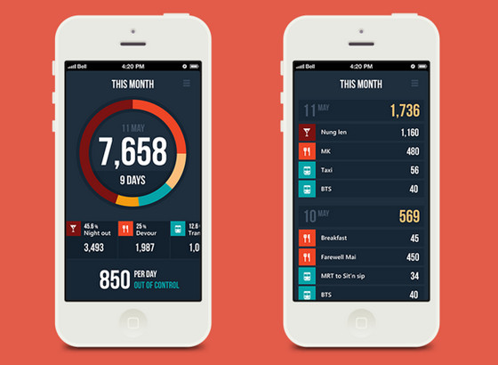
Expenses manager app by DSEEER Kate. The designer capably mixes together typography and muted complementary color palette, making charts and tables look distinctive and subtle. Although each screen has a quite content intensive layout, contrast between background and foreground as well as a lot of whitespace saves the app from being messy and unreadable.
EM by Seven gives a comprehensive overview of statistics, demonstrating data both via traditional table and visually-pleasant variegated pie chart. A range of colors perfectly complements pristine dark background.
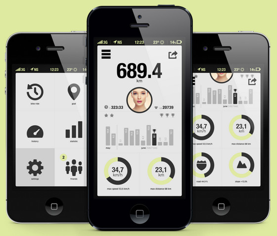
Bicycle app. The designer uses a conventional approach of using dark simple icons against a soft light background that never gets old and easily recreates a powerful contrast. The app represents data via neat clean bicolor doughnut and bar charts.
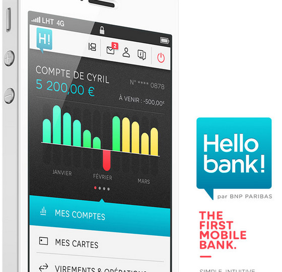
HELLO BANK! IPHONE APP includes a vibrant and rather funny bar chart that easily gives a notion about your account status, and effectively visualizes data.