
One of the most recent trends in website design is making sure that the website is catering to all types of users. With so many people now accessing the web on various mobile devices, this means that your website needs to be easy to use for visitors on different sized devices. The technical term used to describe a website that adjusts to different screen sizes is responsive web design.
Changing Times
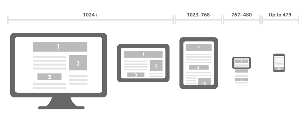
In the past, people only accessed the web on computers. While computer screen sizes varied, they were still within a certain range. So, no matter what computer a person was using, they were likely going to be able to see and use your website without any issues. As mobile web users started becoming more the norm, a problem came up. Mobile users were having a hard time looking at websites due to the small screens on mobile devices. Even worse, there are so many different sizes of mobile devices that designing one standard website that would look good on all screen sizes was pretty much impossible.
This is where responsive web design came in. It allows you to make it so your website adjusts automatically to fit the screen of a visitor. This makes your website usable by anyone, which is huge. Being able to accommodate users on any device means you aren’t going to be losing customers just because they used a device your website wasn’t designed to be viewed on.
Mobile Sites
Before responsive web design became an option in small business website design, businesses were developing two different sites to accommodate mobile users. One site would be the standard computer accessible site and the other was a mobile-only site. Obviously, this had some downsides. It required users to use two different web addresses based on what device they were using. In addition, it was extra work for the business owner.
Having a website with responsive design means you only need one site. Users only need to remember one address. It is much easier and more productive.
Additional Perks
Responsive design has become so popular that the search engines are taking note. They reward sites that use it because these sites are considered more user-friendly. If you are using it on your site, it will give a boost to your search engine rankings. It is probably one of the easiest SEO choices you can make.
In addition, by having your site set up with responsive design, you are prepared for the future. Who really knows what will happen with screen sizes in the years to come. So far, they have been everything from very huge to super tiny. Its anybody’s guess as to what size screens users will be using 20 years from now. By having responsive design integrated into your site, you are ready no matter what happens.
When you are designing your small business website, you need to take many different things into consideration in order to create the best user experience. One of those things is making sure your site can be easily viewed on a range of devices. The easiest way to do this is to use responsive design on your website.