Some of the best web and mobile app designs have a very limited colour range. Two or three colours can be more than enough, and I find that a restrained approach to colour works especially well on de-cluttered interfaces.
This is skeuomorphic design at its best, as the simulated textures actually help add clarity to how the app should be used. This serves in stark contrast to much of Apple’s skeuomorphic work, which generally serve as decoration and can end up being more distracting than anything else.
.
Once again, the realistic elements in this app feel useful and subtle. The clear visual hierarchy makes this UI look incredibly smooth and easy to use.
.
This super clean and engaging mobile UI compliments its Web counterpart perfectly.
.
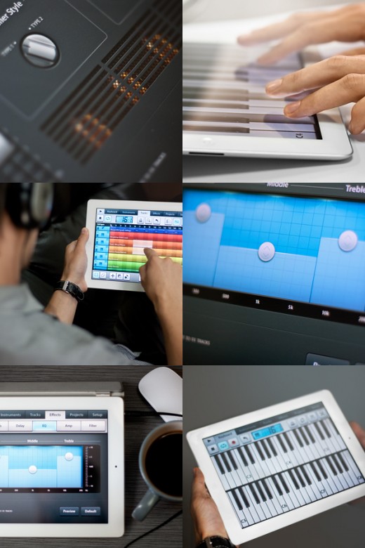
A completely rethought take on FL Studio’s UI for iOS, this UI does the name justice. I particularly like the bright colors of the audio tracks.
.
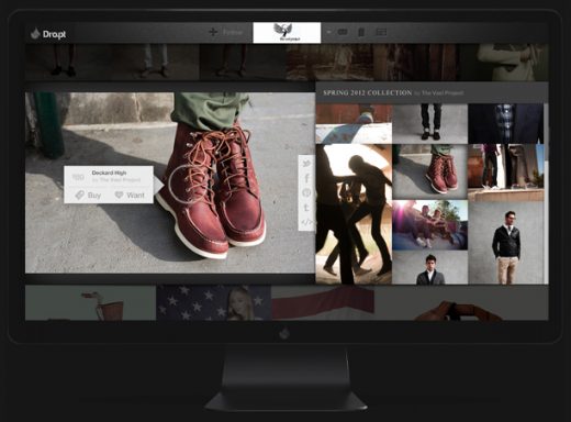
Judging from these mockups alone, I’m loving the app-like user interface of this site. It feels rich, but orderly, and perfect for anyone looking to be distracted by gorgeous imagery for hours on end.
.
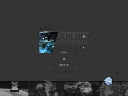
Being particularly experimental and risky, this concept app packs an interesting UI that takes the user through science fiction interfaces and combines them with facts and fiction on the subject.
.
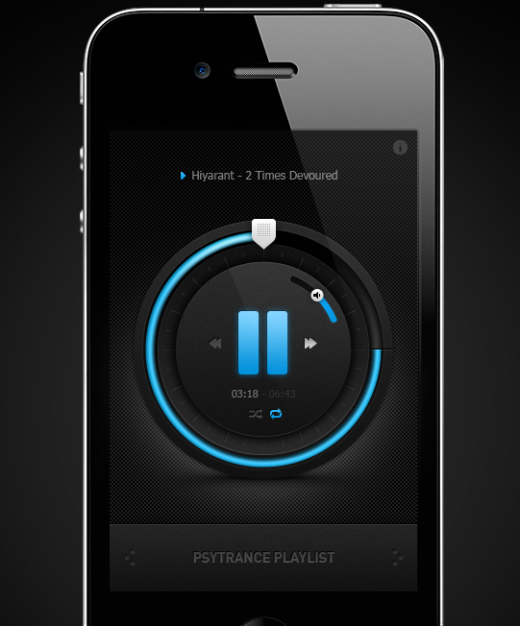
This app concept changes the way you’d envision a music player should and could look on a mobile device. The use of space is certainly interesting, and while smaller controls like volume might be difficult to use while on the go, that particular function is resolved by the hardware.
.
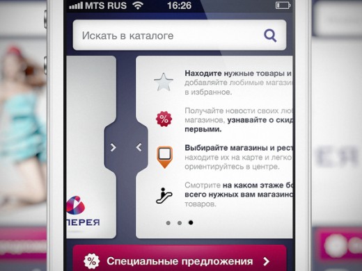
Although much of this app follows very standard patterns, there are a few original and interesting navigation elements (like the cards which you can see above) that serve as pleasant surprises.
.
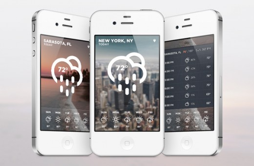
As you can see above, incredibly clear weather pictograms make this app concept quite appealing and instantly understandable.
.
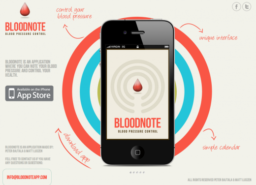
Bloodnote is a simple app where you can track your blood pressure and control your health. Created by Peter Bajtala and Matt Ludzen, This app’s wonderfully minimal UI turns a mundane task into something much easier on the eyes. Read our full review here.
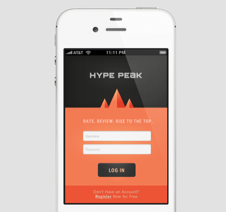
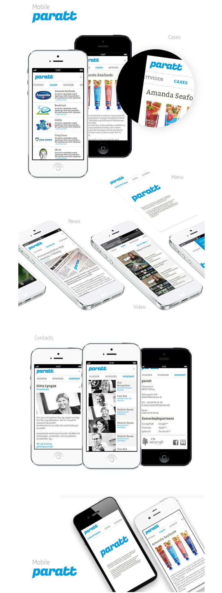
This is a very clean, very content-focused mobile interface, which allows product imagery and logos to inject more colour into the overall look and feel.
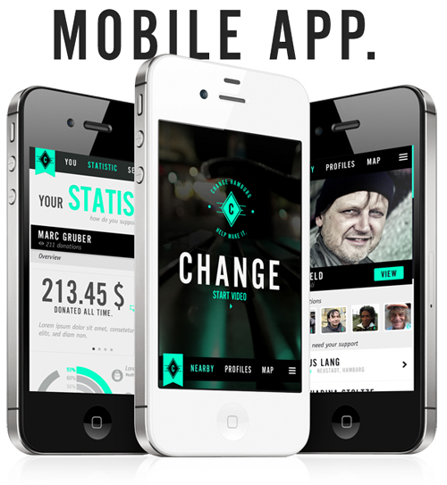
This donation-focused app uses a blend of black, white and peppermint, alongside distinctive typography.
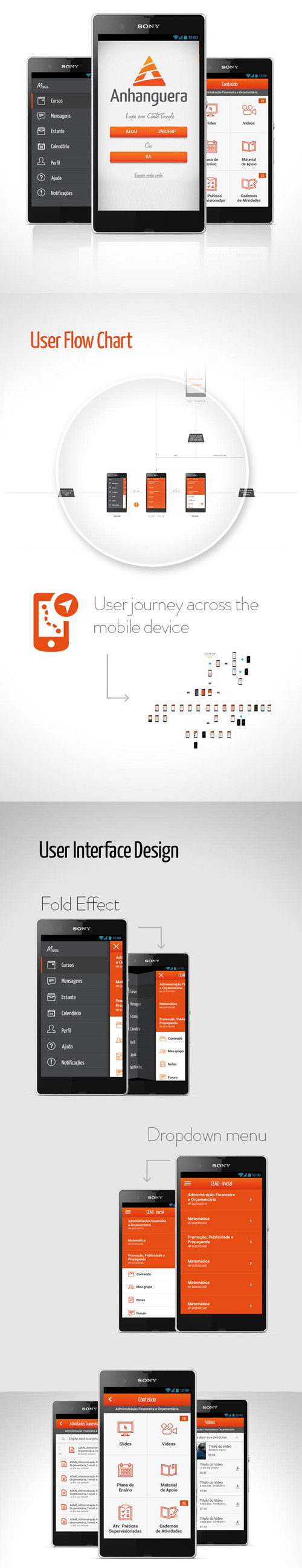
Anhanguera’s brand colours are reflected throughout its mobile site. It regularly inverts these three core colours, to mix things up for the user.
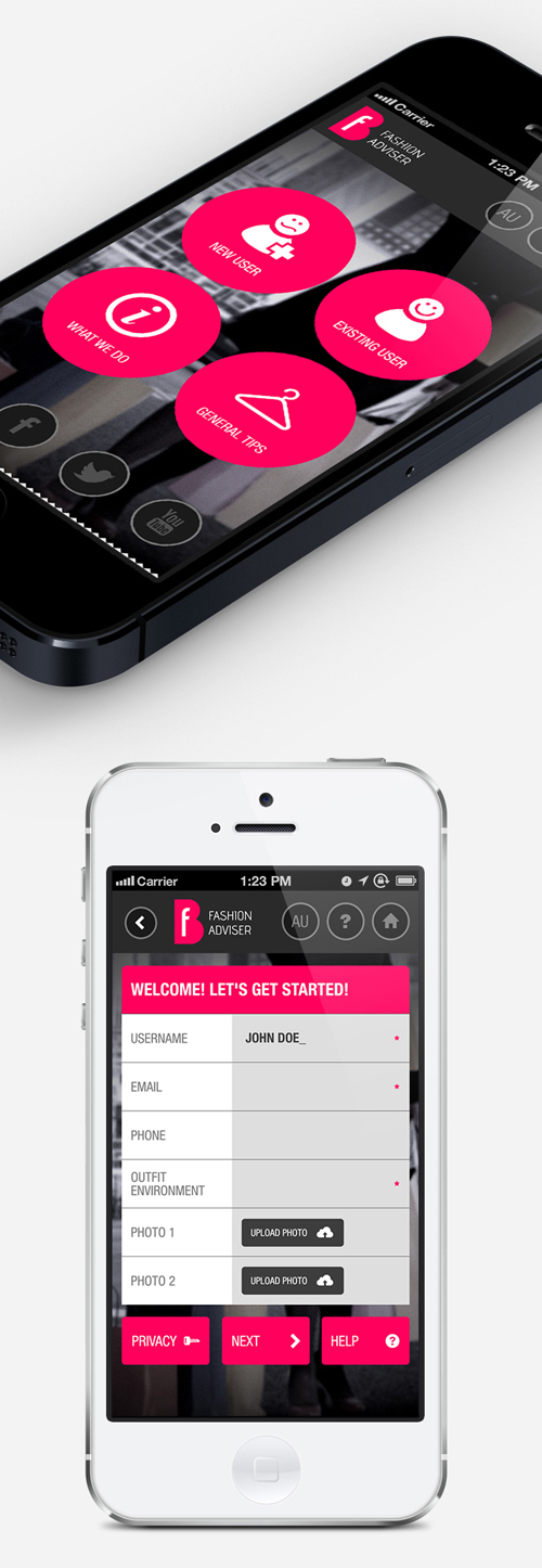
This Fashion Adviser app designer also knows that various shades of grey work a treat alongside hot pink.
This app uses its third colour as a kind of navigational anchor for the eye.