The navigation menuis perhaps a website’s single most important component. Navigation gives you a window onto the website designer’s creative ability to produce a functional yet visually impressive element that’s fundamental to most websites. Because of their value to websites, navigation menus are customarily placed in the most visible location of the page, and thus can make a significant impact on the visitor’s first impression.
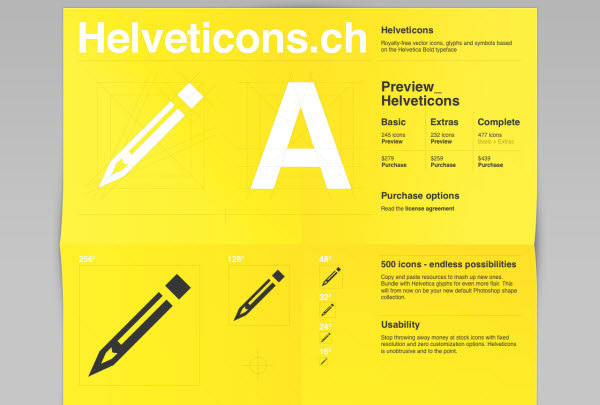
Helveticons
Designed with beautiful typography, this website offers icons with premium quality, and goodies like desktop folder icons, social media icons and Helveticons wallpapers.
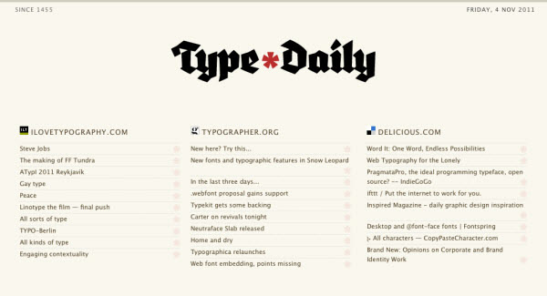
Type Daily
Type Daily is actually a collection of other typography related content on the web. The RSS feeds update the content with the latest ones as soon as they get online.
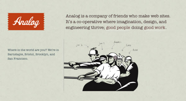
Analog
Analog can be one of those designs which designer understands the contrast factor and used the type which matches the theme of the site very well. The big role that typography played in the site is it enhanced the taste of the colors and the types.
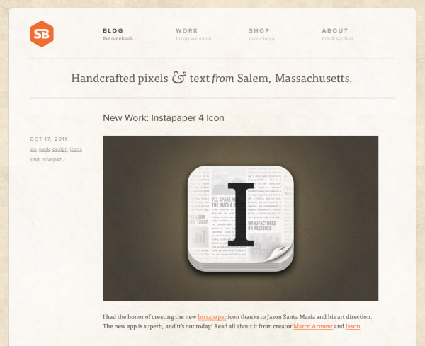
SimpleBits
This user friendly site used the type with such an organized way that it gives out a very neat and appealing look. The navigation in the upper menu has bold uppercase type applied which looks really well with the description type.
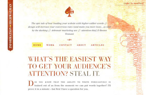
Information Highwayman
Sometimes the background can be greatly enhanced by putting typography art into it, making the site looks even more artistic and appealing.
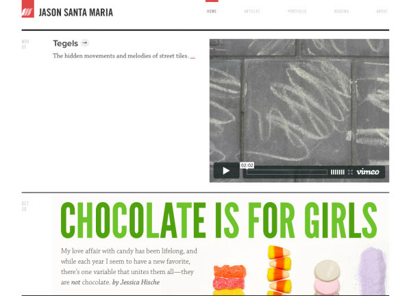
Jason Santa Maria
Typography is the only tool to be played with when you have a minimalist design. The large titles of the articles draw the attention easily.
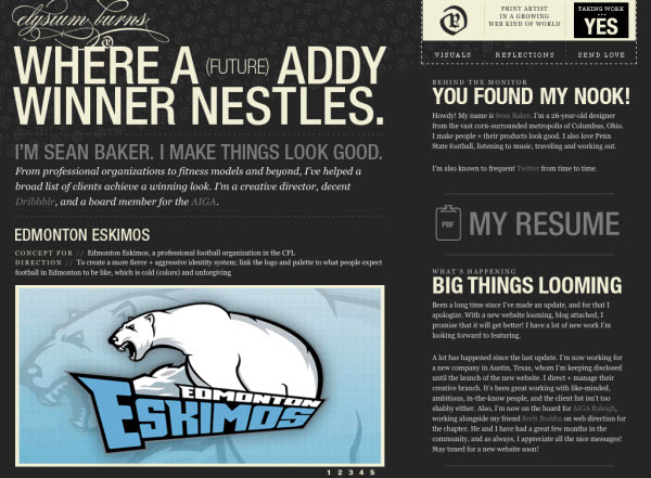
Elysium Burns
You can see there are many elements in this design but they are arranged in such a way that the entire design looks so neat and clean.
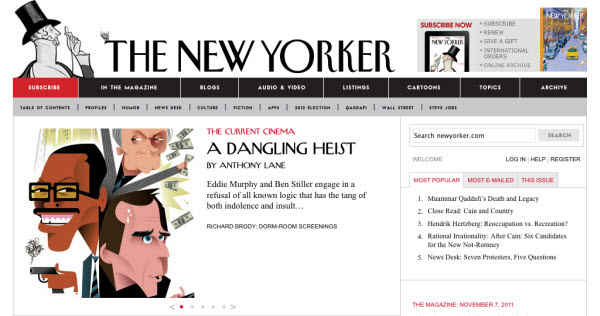
The New Yorker
This magazine website maintains the goodwill of their brand with the help of such good uses of the types on their design. The uses of the types give the reader a sense that the magazine is long-established yet stylish.
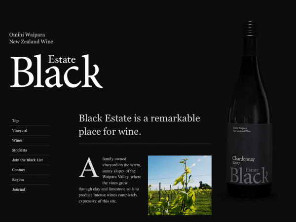
Black Estate
White color type with dark background is one of the best combinations in minimalist design. The design like the one showcased below also greatly increases the text readability.
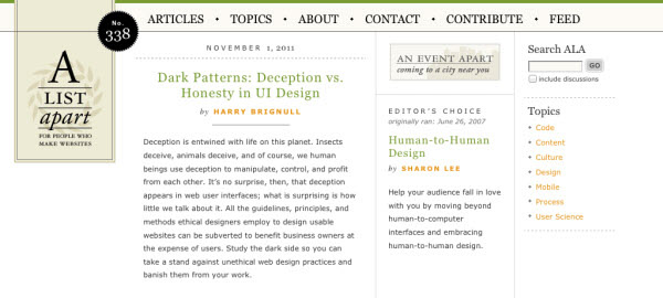
A List Apart
The typography is inspirational here on A List Apart for the way its design elements are centered and its approach to minimalist design. The brilliant use of spacing allows the reader to identify the colors and titles easily.
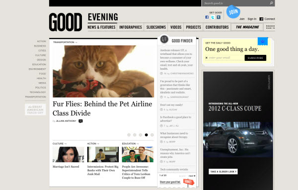
Good
Good uses of clean and excellently spaced types to form a beautiful and readable design.
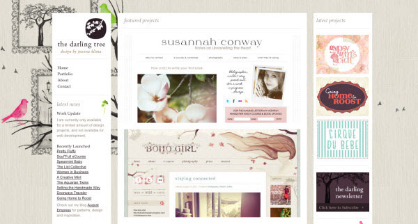
The Darling Tree
The Darling Tree’s brilliant use of various types contributes greatly to the design.
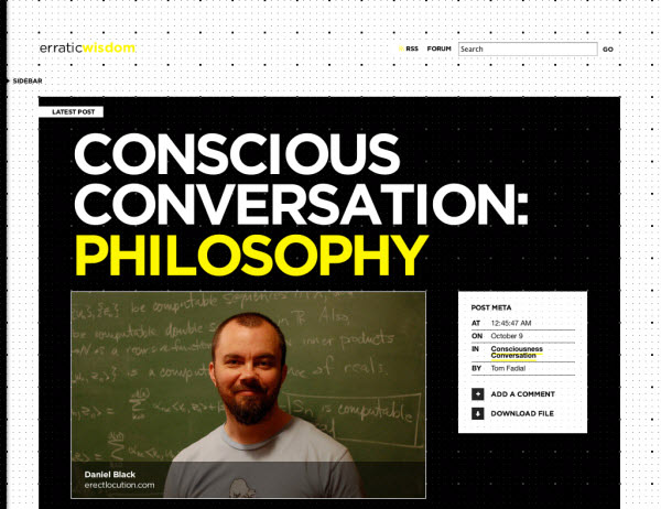
Erratic Wisdom
Black background and bold typography work really well when they are used correctly.
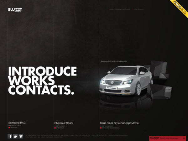
Switch Mediaworks
Incredible mix of typography & visual elements in a very minimal way, talking about getting more from less.