

There isn’t an introduction that I could write for this article cause there is no need for one so I’ll say to you directly that you have here 41 logos that were published online or featured in various galleries in May, the last month of spring.
Jack in the box
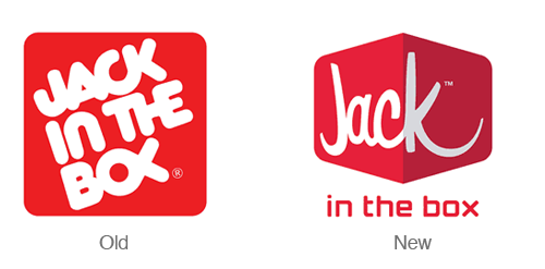
The new logo for Jack In The Box is modern, fun, and quirky – just like their mascot (Jack). The brand extensions for the different types of sandwiches they offer are also fun. The only thing off about the new logo is the “in the box” text that just seems to be placed under the image as an afterthought. This project was designed by Duffy & partners.
Pyramid Beer
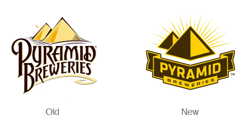
The redesign of the Pyramid Breweries Logo is simple and distinctive. The new logo places more emphasis on the geometric pyramid symbol. The type in the new logo is also much easier to read. The new simplified logo communicates boldness and distinctiveness. The new logo is also accompanied by several new and bold label designs.
Kentucky fried chicken
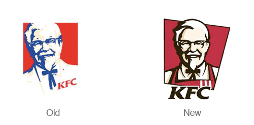
KFC has a nice refresh of their logo – The colonel has taken off his suit coat and put on an apron – like he’s ready to serve you. This version of the logo is much friendlier and inviting. The new angled backdrop to the logo also adds a nice dynamic feel and implies quickness – this isn’t a sit down restaurant! The only thing I don’t enjoy about this redesign is the integration of the type into the symbol. It feels like the type should be more of a separate element rather than attempting to integrate it with the illustration.
Detroit lions
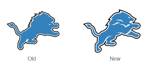
While some may not like the logo – It seems like a step in the right direction. The old lions logo seemed flat and boring. The new re-worked illustration has more definition and defines the arms, legs, mane and face.
Sprint
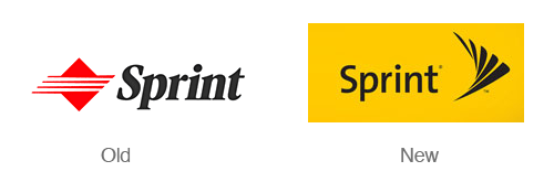
When Sprint merged with Nextel a few years back they underwent massive re-branding campaign. Nextel’s attention getting black and yellow color scheme was merged with The Sprint name. The new symbol is based on sprints signature ‘pin drop’. The switch to a nice sans serif typeface also does wonders for making the logo look modern. This logo really shines when the symbol is set in motion.
UPS
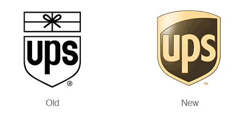
Paul Rand is probably rolling over in his grave over this redesign. UPS decided to re-brand themselves a few years ago (2003 to be exact). The new design feels much more modern and and clean. That being said I could do without the 3d effects. The logo was designed by New York-based FutureBrand.
Chicago Olympic Bid
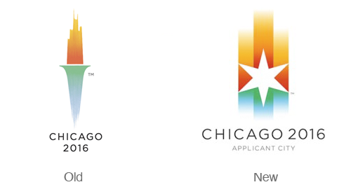
While I was sad to see the brilliant Chicago torch logo go, the new version of the logo is just as brilliant. The new logo features warm gradients that represent the sunset and cool gradients that represent lake michigan. The star is a design element that is borrowed from the city flag and represents a compass pointing in all directions radiating out to the world. Overall I think this is a great redesign full of rich symbolism.
The Bahamas
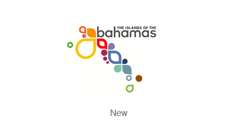
After some extensive research I could not find the original Bahamas logo, but the design itself is amazing enough to mention. This identity is fresh, dynamic, fun and colorful – much like a vacation in the Bahamas. Read more about the logo at the Duffy & Partners blog.
Argentina

I was unable to find the previous branding for Argentina. The new logo is part of an evolving and dynamic design system. The ribbons of the logo communicate passion, expressiveness and change. Designed by Guillermo Brea & Associates
Citi
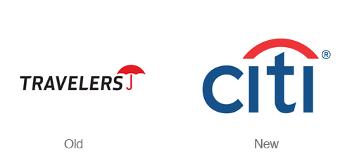
Can you imagine designing a logo in just a few seconds (and 34 years of experience)? Paula Scher did just that in a client meeting with then named Travelers group insurance. The company was re-branding but wanted to maintain their distinctive umbrella symbol. This logo is simple and brilliant in the way it combines a simplified version of an umbrella and simplified type. Designed byPentagram.
Delta Airlines
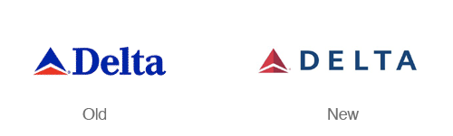
More of a realign than a redesign – this new delta logo is sharp! The colors in the new logo are more subdued and the choice of a all caps sans serif typeface makes the logo feel more modern. The new symbol also has a nice dimensional aspect to it without getting into cheesy 3d effects. Designed by Lippincott Mercer.
Cisco Systems
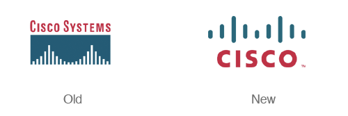
Cisco Systems updated their logo and name back in 2006. With the shortened name and the new simplified ‘bridge’ this logo is much more bold and memorable. Designed by Joe Finocchiaro and Jerry Kuyper.
BP
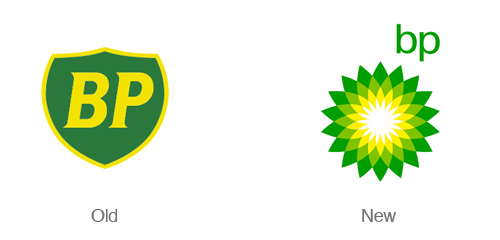
The BP logo redesign takes a boring, static shield with initials and transforms it into a bright, colorful clean flower. This logo is an attempt to move the company in a completely new direction (or just reflect that in the image). Designed by Landor.
Gatorade
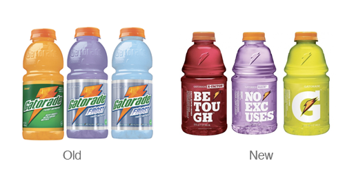
Gatorade is the only part of the Pepsi re-branding scheme that I actually enjoy. I love the new simplified G and lightning bolt. I’m also quite fond of the bulky slab serif font used on their packaging.
Envato
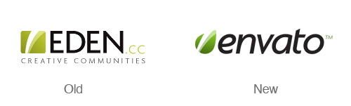
The eden/envato re-brand a logo update is refreshing and simple. I love that they kept some of the elements from the original logo and included them in the leaf. The original logo and named portrayed a sense of springing to life with creativity and this has been carried through to the new design. Designed by Collis Ta’eed.
Best Buy
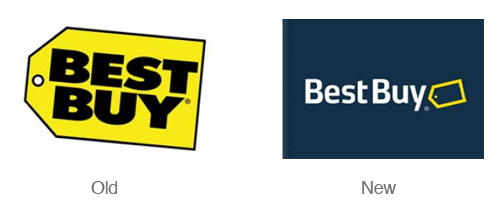
Best Buy takes a step away from their large, chunky yellow price tag and ultra bold typeface for a more modern, less in your face logo. The new design still features the signature yellow tag – but in a much more subtle way.

