

when it comes to Web design, the tools you use play an integral part in your results. Of course, we’re big fans of getting down to the basics, like putting pencil to paper, but sometimes finding new apps and resources can help you get those creative juices flowing.
jQuery Nested
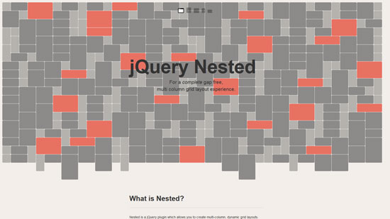
Nested is a jQuery plugin which allows you to create multi-column, dynamic grid layouts. Unlike other libraries and jQuery plugins similar to Nested, this is (as far I as I’ve know) the first script out there that allows you a complete gap-free layout.
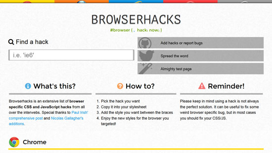
Browserhacks
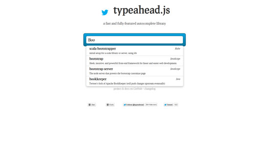
typeahead.js
GroundworkCSS
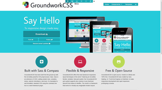
GroundworkCSS has been built from the ground up with the incredibly powerful CSS preprocessor, Sass. Sass is an extension of CSS3, adding nested rules, variables, mixins, selector inheritance, and more. It’s translated to well-formatted, standard CSS using the command line tool or a web-framework plugin.
Cool Kitten
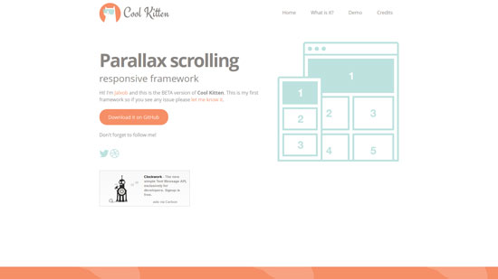
Cool kitten is a collection of HTML/CSS and JavaScript files to be used for web designers and developers.
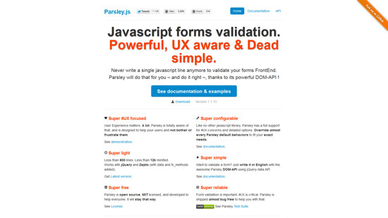
Parsley.js
MUELLER
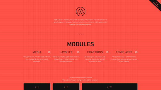
MUELLER is a modular grid system for responsive/adaptive and non–responsive layouts, based on Compass. You have full control over column width, gutter width, baseline grid and media–queries.
BLOKK
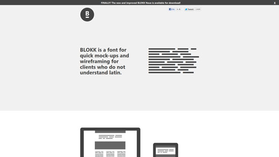
BLOKK is a font for quick mock-ups and wireframing for clients who do not understand latin
Conditionizr
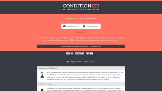
Conditionizr is a fast and lightweight (3KB) javascript utility that detects browser and pixel ratio, allowing you to serve conditional JavaScript and CSS files. Rebuilt from it’s jQuery predecessor, it’s now 50% faster.
#50C1AL

PROFOUNDGRID

A responsive grid system for fixed and fluid layouts. Built in SCSS, it gives you flexibility and full control.
The Wookmark jQuery plugin

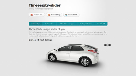
Threesixty-slider
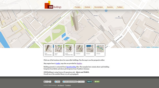
OSM Buildings
xy.css
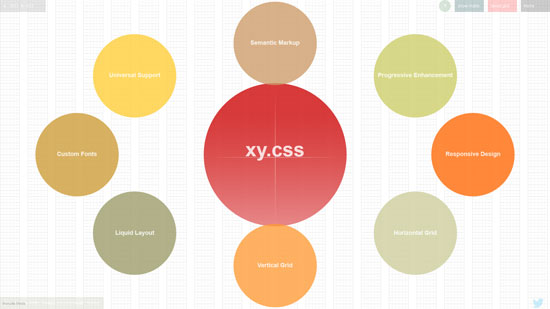
xy.css is a lightweight CSS template for building responsive liquid-grid designs. xy.css neutralizes rogue browser styles and brings horizontal and vertical rhythm via synergized grid system for both typography and structure. xy.css helps you create clean, device-neutral designs without cluttering markup with non-semantic class attributes.


I have noticed you don’t monetize templatesperfect.com, don’t waste your traffic, you can earn additional cash every month with new
monetization method. This is the best adsense alternative
for any type of website (they approve all sites), for more info simply search in gooogle: murgrabia’s tools