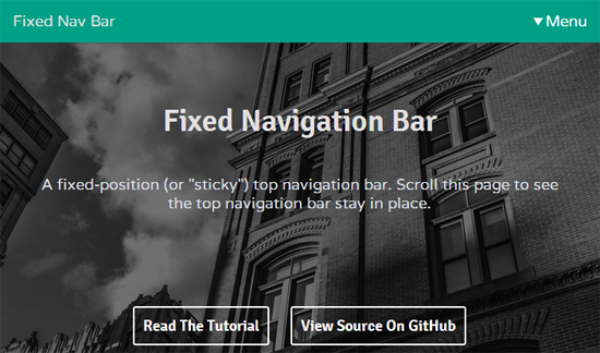
A fixed header bar is a great web design feature that allows your users to access your navigation anytime they want without having to scroll all the way up to the top of your site. Of course, there’s a big difference between well-designed fixed header bars and poorly designed ones. If you plan on making this a feature on your site, you should learn from these 15 websites that are using fixed header bars in some of the most creative and innovative ways.
1. Pussh
This website offers a free download for a fitness tracking app on a long form sales page. In this example, the fixed header bar keeps track of where you are on the page with a dark underscore under the links. This allows you to go to different section of the page from the header navigation.
2. Jacquet Droz
This luxury watch retailer not only uses a fixed header bar, they use a header bar that drops down a visual navigation bar. This normally isn’t a viable strategy as you need a fast web hosting server and a lot of loading time optimization since it’s graphic intensive. However, it works here because the watches are so visual and it helps consumers find the watch line they’re looking for.
3. Ditto
Ditto does something smarter than many fixed headers. The header disappears when you are scrolling and comes back when you stop moving your mouse. This lets you use the header navigation when you need it. It’s not clear how intensive it is to a web hosting provider since they’re also using a lot of parallax design.
4. GrazSecrets
Graz Secrets is an app site that uses a header bar with an animated image in the middle that serves as a call to action. They also made a smart decision of making the header bar take up a minimal amount of space. Too many websites tend to take up too much real estate with their fixed header bar.
5. GroveMade
GroveMade uses a hero image to introduce their line of watches. The fixed header navigation blends in with the image. But as soon as you start scrolling down to the product listings, the header bar turns black to provide contrast to the white background which is really smart.
6. Drew Wilson
If you don’t need a navigation menu for your header bar, you can do what Drew Wilson did. The artist uses a transparent header and puts the home link and his social media profiles on the end corners. Doing this ensures that the header doesn’t get in the way of the browsing experience while being there when you need it.
7. Underbelly
At first glance, you see a bold header bar that takes up a decent amount of space. However, Underbelly designed their fixed header bar to minimize its size by 50% when you scroll down. This simple move minimizes the distraction from the header navigation.
This company uses their fixed header bar to feature the brand and logo prominently. It takes up a decent amount of real estate but it also gets the job done in terms of reminding you of their company. The graphics on the header bar also is connected to the parallax design for a great presentation.
Mint Design Company uses a beautiful fixed header bar that is completely made of sketch-animated icons. The icons animate when you mouse over them for a really interactive browsing experience that actually makes you want to use their header bar to browse the site.
10. Under Armour
Under Armour uses a basic fixed header bar that any eCommerce site can use. It provides a drop down menu that allows you to find what you’re looking for. The header bar also doesn’t take up that much real estate, so it doesn’t distract you while you’re shopping.
11. Make Better Apps
Make Better Apps has a transparent grey fixed header bar. It is centered and doesn’t take up the whole row which makes the design look more breathable. The great thing about the header bar is that it highlights to a bold red color which immediately helps you notice when you are hovering over the navigation menu.
Kitchen Sink Studios does something that other sites are not doing with their header bars. They’re only making the fixed header bars appear when you scroll up. If you’re scrolling down or stationary, the header bars disappear to help you focus on the content.
13. Gnosh
Gnosh has a very interesting design for their fixed header bar. It is designed as a peel away on a newspaper similar to the content boxes on their webpage. They also keep it very minimal and small so that you focus on their graphic intensive brand presentation.
14. Y.CO
Y.CO uses a fixed header bar that’s transparent. But instead of using one with actual navigation, you are only provided a hamburger icon on the far right. It’s only when you click on this icon that you’re presented with a layer of transparent navigation which you can close to go back to the main page.
15. Psych & Psych
Psych & Psych uses a transparent fixed header bar like many other sites on this list. However, they turn the transparency way up so that you can clearly see the content you’ve just scrolled down from. This helps you transition and connect the dots from one part of the content to another.
Those website layouts should give you a lot of ideas for working with fixed header bars. Fixed header bars are not ideal for every site but can be user friendly for a wide variety of sites like content and eCommerce sites.