
CSS preprocessors, such as Sass, can help in keeping code DRY and modular. For JavaScript, RequireJS promotes great, decoupled code if used correctly. But even with the best code in the world, testing all the responsive variations is the only way to be confident the site works.
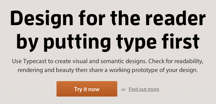
Responsive.is
Created by typecast, Responsive.is is an online responsive web design testing tool that only requires you to enter your site URL and press GO. In the auto mode the tool gives you a preview of typecast.com by default. Type in your URL and check to see if your responsive design fits appropriately on the desktop, tablet and smartphone screen-size simulators
.
Responsive.px
Enter the URL of your off or online site to see how it looks on different screen sizes (both standard and custom sizes included). You can find the exact breakpoints in pixels and update your web page’s media queries to create the responsive design you are looking for. You can also share the URL of the adjusted site viewport with your colleagues to discuss your design modifications online.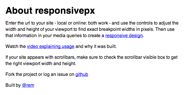
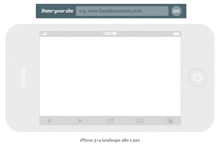
Responsinator
Responsinator lets you preview your web page on smartphones and tablets in both portrait and landscape mode. Due to the virtual screen size borders on the digital device simulators, Responsinator gives you a realistic experience of viewing your site on multiple screens.
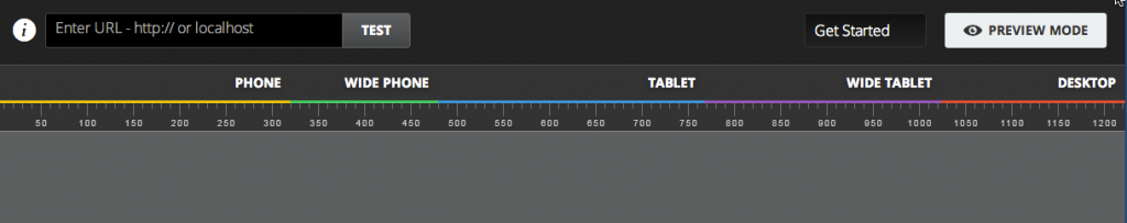
Responsive Web Design Testing Tool
Test your responsive web design by width size or device size with this user-friendly testing tool. Devised by Matt Kersley, there is also a GitHub repository available so that you host your site on your own server for testing.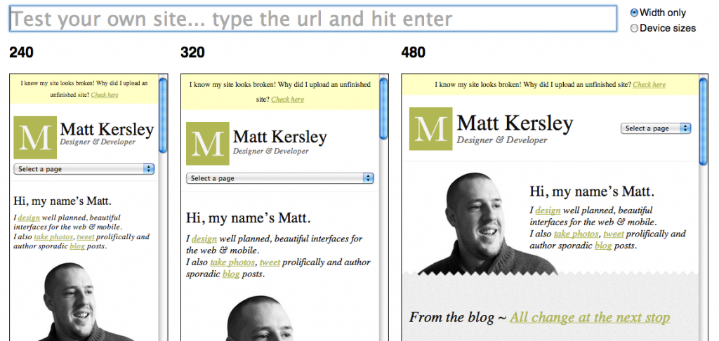
Screenfly
Screenfly is an online digital device simulator tool that is extremely easy to use and gives you a wide variety of options, including visualization on variously sized desktop monitors and on a virtual television screen.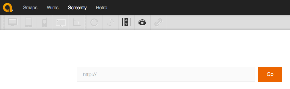
Designmodo Responsive Test
Designmodo is a responsive website testing tool that helps test your website among an extensive choice of screen sizes. Just type in the URL and select the device type or enter a custom dimension.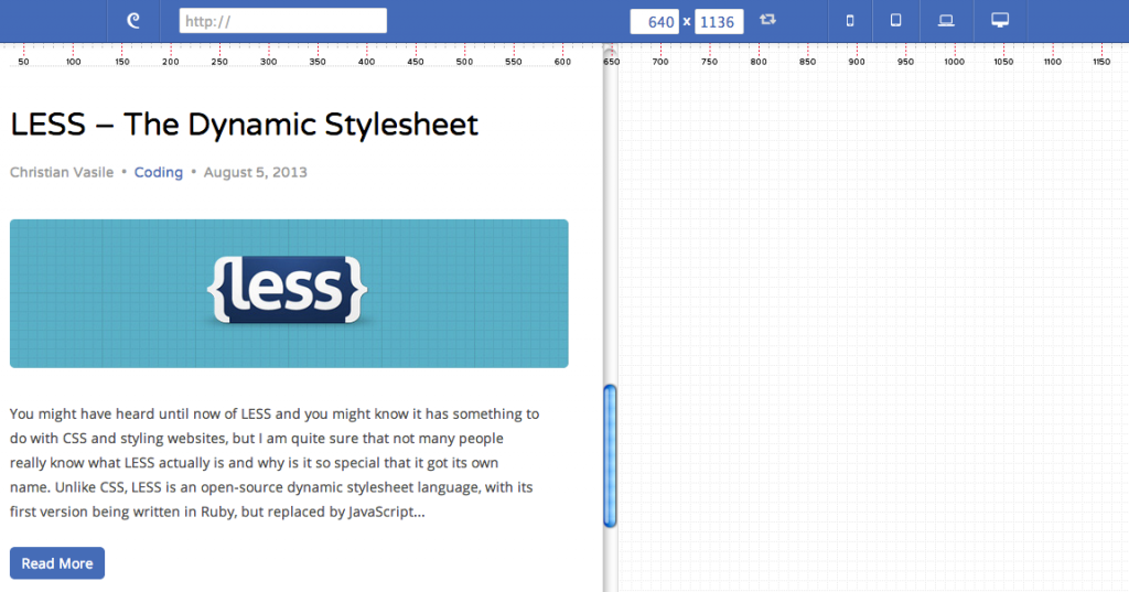
DimensionsApp
DimensionsApp is yet another mobile and tablet online simulator that helps you test your responsive website at various browser sizes. It also lets you preview it on a virtual smartphone/tablet at different orientations using the rotate option. You can work offline using their Chrome app extension
.
The Responsive Calculator
Responsive web design works well with a percentage-based layout, which is exactly where this tool comes in handy. It helps you convert your pixels into percentages with a single click.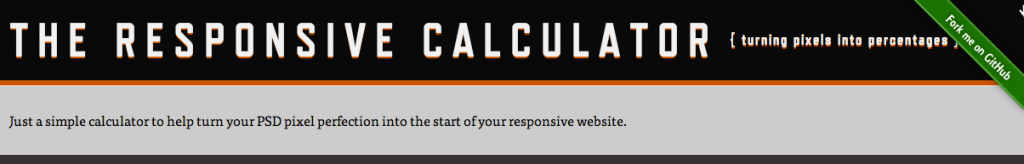
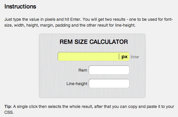
Responsive Design Calculator
Most fluid designs use the REM (root em) unit and if you are among those who use REMs to set font sizes on your fluid layout, this calculator tool is for you
.
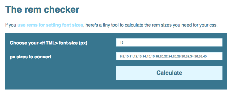
REM-Calculator
Another REM calculator tool is provided by offroadcode.com and it helps you convert your font sizes from pixels to REM.
Simultaneous device browsing
Once you start to build up your collection, a tool like Remote Preview saves a lot of time. It lets you preview your site on a large number of mobile devices at the same time, so you can quickly scan through your pages across devices and pick up layout and behaviour issues.
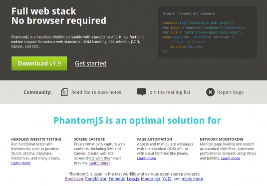
Visual regression tests
PhantomJS has another killer feature. You can take fully rendered screen shots of your site. We use this to crawl the site, taking shots of pages on our live site and re-running on our test server. You can process the images with ImageMagick to compare each page at each resolution. Picking out visual regressions becomes a piece of cake.