
Responsive web design simply makes sure that webpages can adjust to the device in use depending on its width. Why is this important? For starters, with all the people surfing the net on tablets and smartphones, it’s vital for devices of all sizes to access websites. There are, of course, other reasons why responsive website design can give your site a boost. Since this concept is new, it will give you a competitive edge.
Justin Aguilar
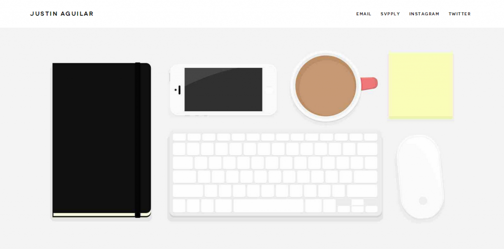
This website is beautifully simple and is a great example of responsive, flat UI. The colour scheme is inoffensive, easy on the eyes and I love the subtle highlights of colour.
ZURB
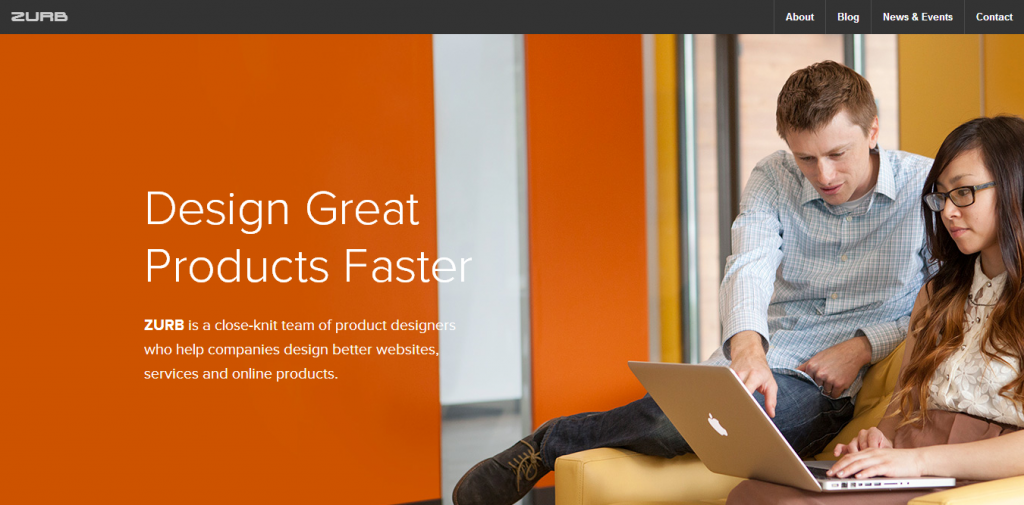
ZURB has a great colour brand and is a great example of responsive web design in 2014. When the responsive design kicks in, the colour scheme and header totally changes to give two totally different experiences to the user.
Dane Bowen
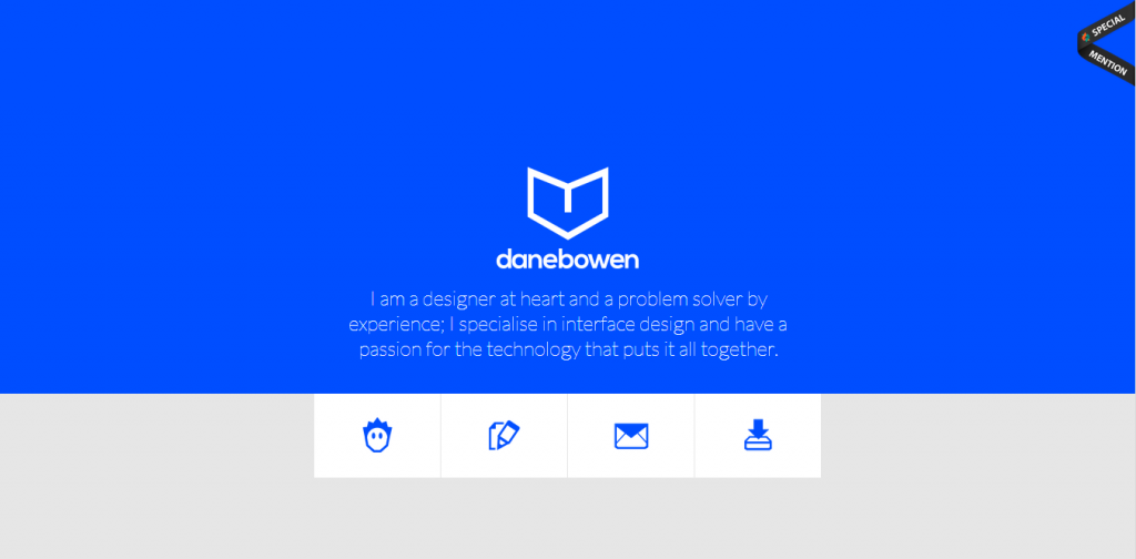
Dane Bowen has used a very bold colour with a heavy use of iconography to keep a simple design interesting. When viewed on a smaller device, the icon boxes are turned in to large, easy to use lists.
2nd Floor
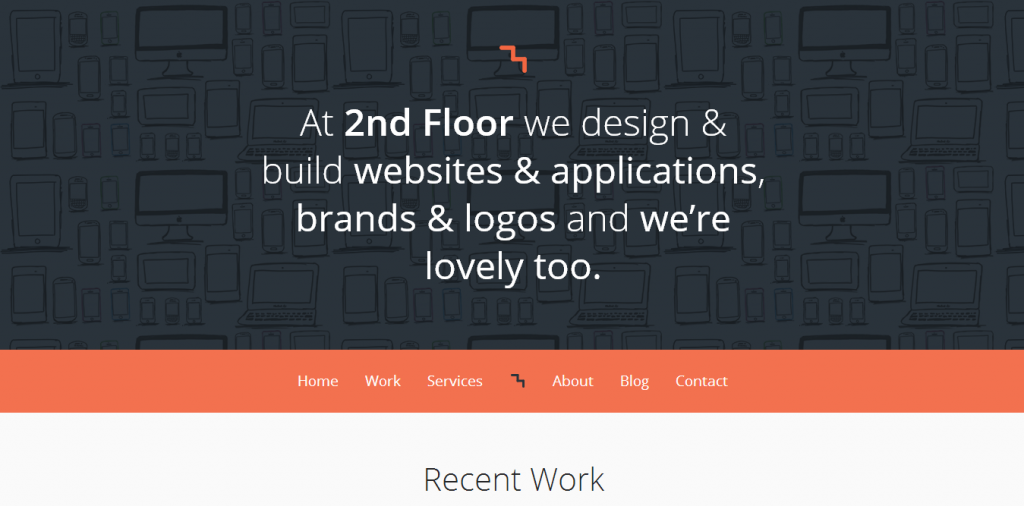
2nd Floor have a nice light, clean design with some awesome fonts (Geeky I know…). They have used a grid method here meaning when viewed on a smaller device, the design changes from multi-columns to a single column.
Mostly Serious
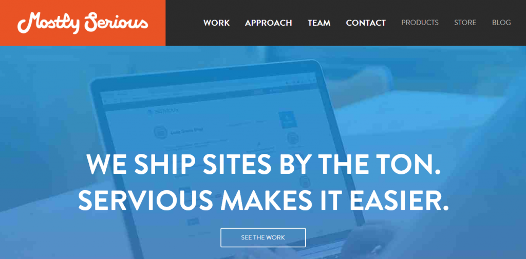
Mostly Serious use large but little typography to fill the page without bombarding the user with too much information. This is a classic responsive design with another grid layout and the menu is a beautifully simple responsive drop down.
Joshua Johnson
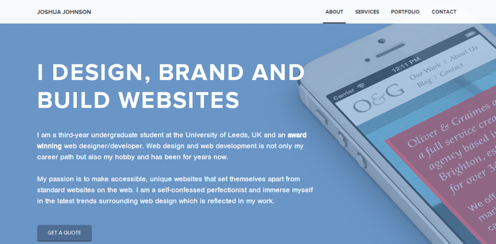
Josh Johnson had used a nice baby blue, my favourite colour to use in design, to create a clean, eye pleasing design. My favourite part is the inspired homepage portfolio that cleverly shifts in to one column on a smaller device.
Magnetic Zero
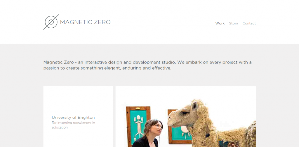
WOW. I love this design, even though this post is about responsive design, this is one of my favourite designs I’ve come across for a while. Inspiringly simple with a grid layout gives this the ease of navigations and the simplicity to get their message across.
Draftfcb
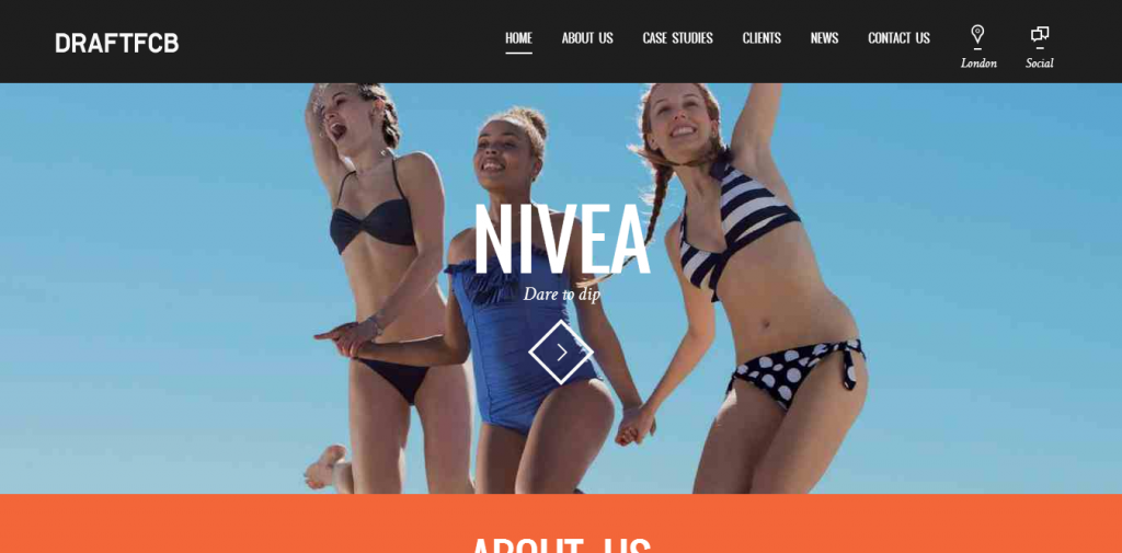
This website hits all the right buttons. Full page design, large boxes and typography with some amazing photography and they make the use of the great photography when viewed on smaller devices.
Merixstudio
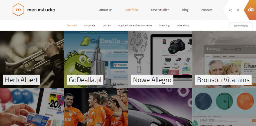
Merixstudio love their grids and so do I. The homepage features a large, short statement with 3 of their chosen projects in a grid style that effortlessly shifts in to one column when viewed on a smaller device.
MezzoLab
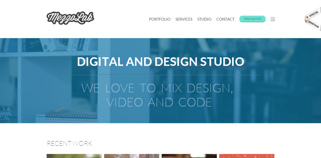
A truly beautiful website with a great use of fonts and colours. My favourite thing about this website though is that the text slowly grows and shrinks depending on the screen size. I am easily pleased.