One more logo showcase, but in this one you really will need to look twice! Every logo is carefully picked with second thought and I think such logos are really hard to create. Get inspired, hopefully this article will help you to look different at logo creation – it’s not always just about typography, good looking font and nice animation.
1. Texas association of stolen children
Designed by Sibley/Peteet design
This one is my favorites logos and it is unforgettable! White playhorse which everybody knows and can recognize with black colored outline of child on the horse and black background which makes an illusion that child had disappeared. Amazing, what designers can create just from shapes and two basic colors!!!
2. Avid Technology
Designed by The Brand Union
Avid’s logo is composed of simple geometric shapes derived from the fundamental buttons of the digital audio and video solutions: volume up, volume down, play, pause, record and forward, signaling of the companies core audio and video offerings. Company’s name is spelled out in distinctive and abstract letterforms.
![]()
3.Bison, Vancouver
Designed by Seamoose
Logo design for rock band from Vancouver B.C. This logo is very intelligent solution in my opinion.All what designer did was take all the letters of the word BISON and make them look like a bison body. I like the way how the body details are found within the letters, as tail or horn. The version linked seems like a much easier execution.
![]()
4. Eight
Designed by Stylo Design
Really original and fresh logo design with variations of an 8 to made word eight. Even the placing of TM is placed in the right place to create an angle and clarity of the design.
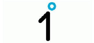
5. One Degree
Designed by Landor Associates
This logo was created to drive public action on climate change. If everyone could change their behavior by just one degree, we could change the future of the planet. Both – number 1 and symbol of degree represents a person and meaning of conception.
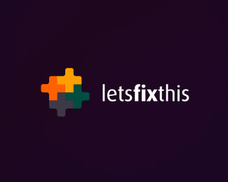
6. Lets fix this
Designed by dache
This logo was created using different colored puzzle pieces locking together in the shape of a cross and represents how many parties can come together and fix their own problems in an online resource.
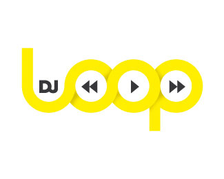
7. DJ Loop
Designed by mavleeb
Don’t need any explanation .Simple, smart and clear.
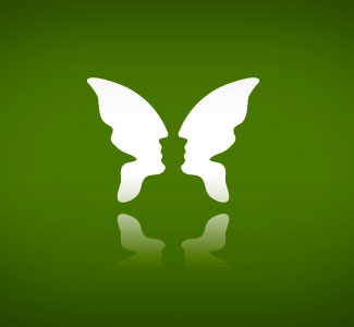
8. Friedman psychology group
Designed by Mugar Mihai
Butterfly, two faces, person with wings or maybe inkpot? Freedom of mind. Fantastic and awesome representation of the field it was designed for.
9. Guild of Food Writers
Designed by 300million
Logo for guild of food writers. Spoon within a true nibbled fountain pen. There is a meaning!

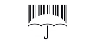
10. CSCN
Designed by Jovan Rocanov
The idea of this logo, which is designed for Consumer Society and Citizen Networks, of course was to show the protection of the consumers. There is combined a well-known symbol of the market such as the bar code (which graphically looks like the rain) with an ordinary umbrella (symbol of protection).
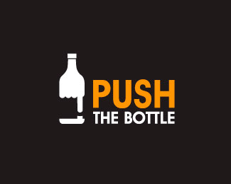
11. Push The Bottle
Designed by hemisferiod
Manipulation of the words within the clever graph representation.
12. Invisible Agents
Designed by AlexWende
They provide custom data driven web and application solutions and enables designers to incorporating their graphics into this solutions.
![]()
13. Piano Forest
Designed by JasonCho
You can see forest and piano keys and can see them together…So clever and clear!!!
![]()
14. Wiesinger Music
Designed by NEXQUNYX
This logo is the sort of simple excellence that can inspire. Great monogram. Smart solutions.
![]()
15. Logotomy
Designed by logotomy
Logo design for personal name. It speaks by itself and the opened forehead is what draws you into the surprise of a TM…
![]()