Some of the best web and mobile app designs have a very limited colour range. Two or three colours can be more than enough, and I find that a restrained approach to colour works especially well on de-cluttered interfaces.
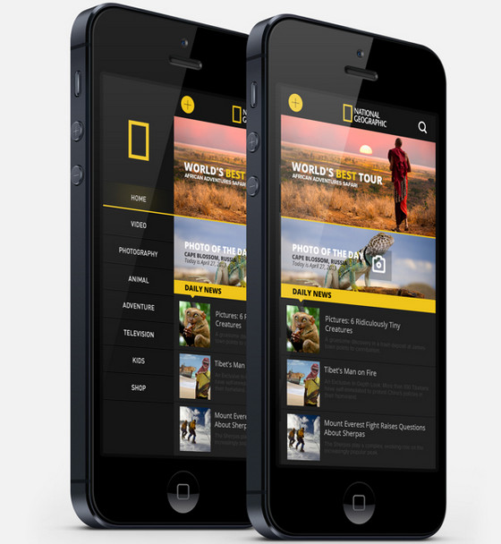
National Geographic Re-design looks sophisticated and stylish. Dark and yellow color palette never gets old; it is beautifully accompanied by white font and spectacular nature shots.
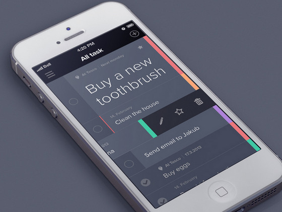
Taasky by Jakub Antalík has a refined appearance. Grey background is nicely brightened by muted color palette and rainbow-like panel on the right side.
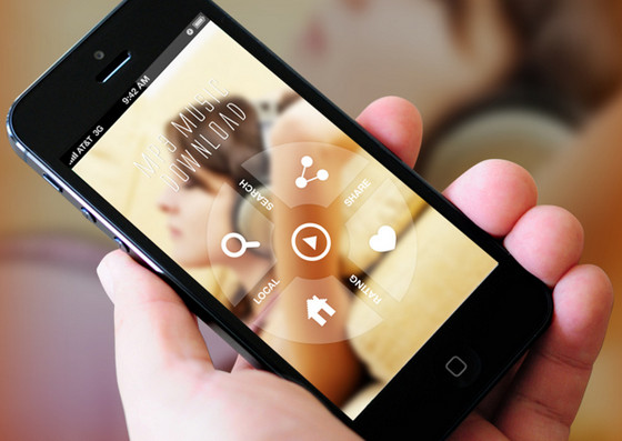
New Music App by Amit Rai delivers overwhelming first impression, fascinating users by vibrant warm background and exquisite almost transparent circular navigation panel.
PicLab by Roberto Nickson utilizes bright colors in order to make interface inviting, and also provides colorfully executed footer with settings.
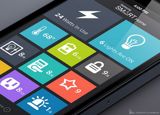
Samsung Smart Home App Concept by Ali Rahmoun
Samsung Smart Home App Concept by Ali Rahmoun has indiscrete lively tile-based outward. It also depicts colorful grid along with white flat regular icons.
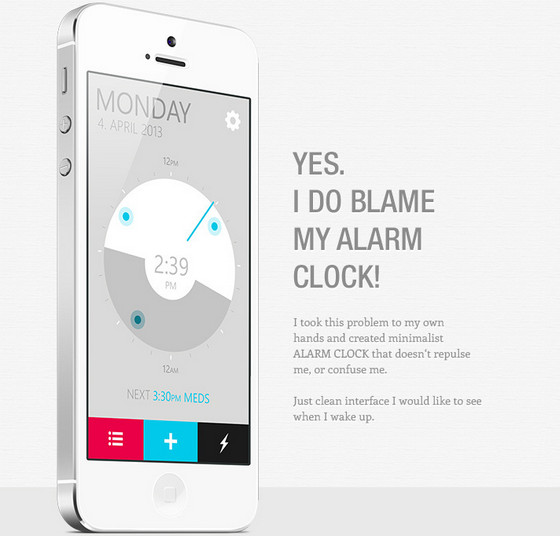
Alarm Clock App by Samuel Bednár
Alarm Clock App by Samuel Bednár has a truly minimalist vibe, leveraging grey color scheme, plane graphics and several vibrant elements.
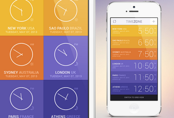
Time Zone App Concept by GraphicBurger
Time Zone App Concept by GraphicBurger has a brisk color-driven interface that capable of representing data both in lines and as a grid. Both approaches are spiced up with glaring and alluring shades.
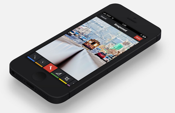
Snapseed Redesign by Shiping Toohey
Snapseed Redesign by Shiping Toohey features full-screen showy photo background that is supported by vivid flat-style footer with settings.
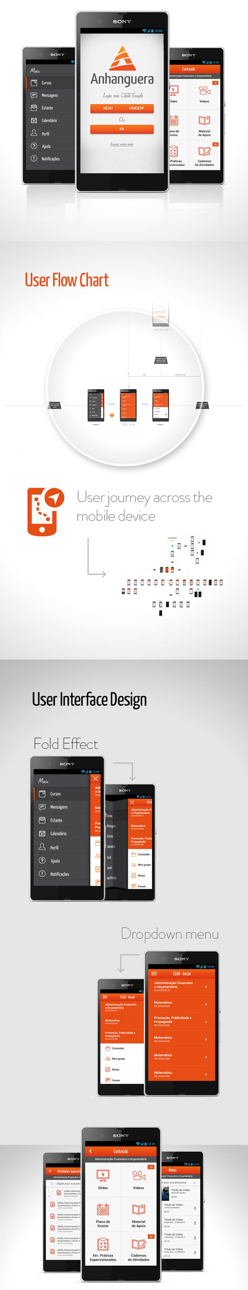
Anhanguera’s brand colours are reflected throughout its mobile site. It regularly inverts these three core colours, to mix things up for the user.
This Fashion Adviser app designer also knows that various shades of grey work a treat alongside hot pink.
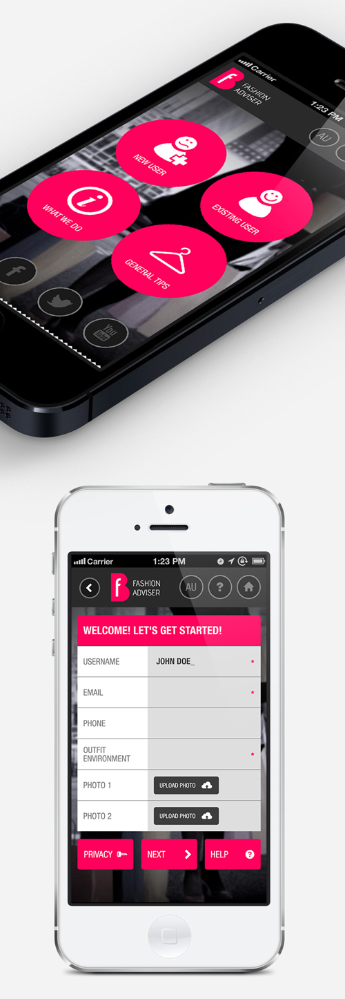
This app uses its third colour as a kind of navigational anchor for the eye.
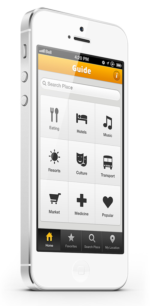
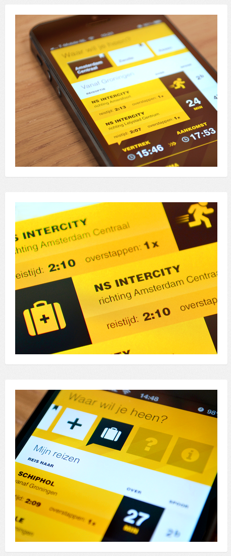
One of the nicer travel apps that I’ve seen.
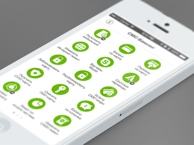
Icons are proving increasingly popular. Ultra-obvious icons don’t require any labels, and are better still.
An interface design for a Bitcoin app, by Karol Ortyl. Clean, strident typography, and a good example of reversing out colours.
![]()
Very clean and very flat, though the colours aren’t to my taste.
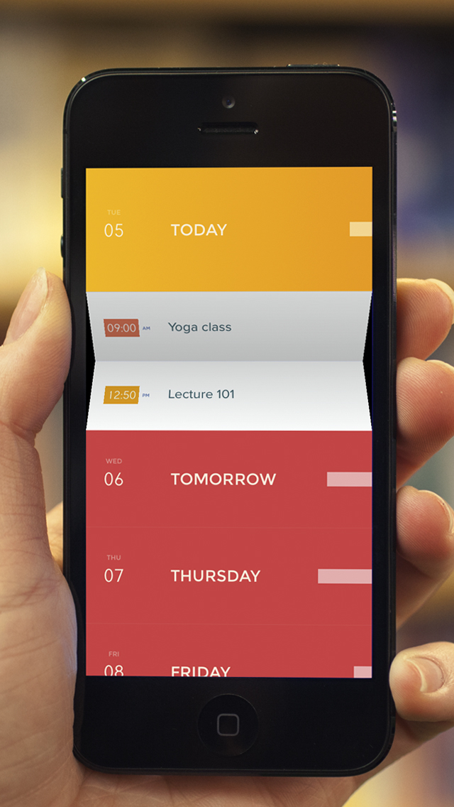
“The calendar, humanized” is the strapline. This certainly appears to be a rather elegant way of expanding content on a mobile device, and isn’t something I’ve seen before.
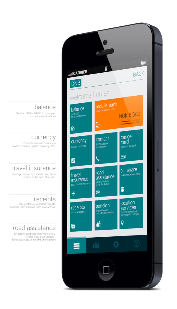
This mobile app design from DNB uses three main colours to establish a compelling visual experience for users. This makes good use of limited screen estate, with clear navigation prompting the user into action.
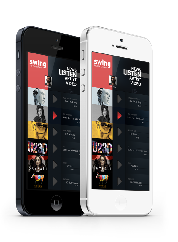
Swing is a concept for a music app that has embraced flat design. No visual clutter. Lots of black, white and red, with images once again used to add colour.