

Sometimes a logo becomes and icon in and of itself. Think about all the logos that you have seen over the years. There are several out there that you will always remember and can be seen and recognized almost anywhere. Some examples are the two hands clasping that represent the boys and girls club, or a red octagon which stands for stop. A more famous one would be the apple from Apple computers and today’s iPhones.
Pyramid Beer
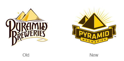
The redesign of the Pyramid Breweries Logo is simple and distinctive. The new logo places more emphasis on the geometric pyramid symbol. The type in the new logo is also much easier to read. The new simplified logo communicates boldness and distinctiveness. The new logo is also accompanied by several new and bold label designs.
.
Sprint
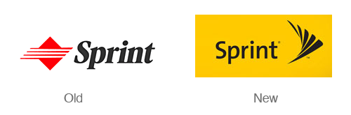
When Sprint merged with Nextel a few years back they underwent massive re-branding campaign. Nextel’s attention getting black and yellow color scheme was merged with The Sprint name. The new symbol is based on sprints signature ‘pin drop’. The switch to a nice sans serif typeface also does wonders for making the logo look modern. This logo really shines when the symbol is set in motion.
The Bahamas
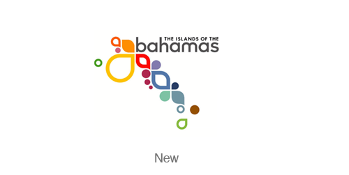
After some extensive research I could not find the original Bahamas logo, but the design itself is amazing enough to mention. This identity is fresh, dynamic, fun and colorful – much like a vacation in the Bahamas. Read more about the logo at the Duffy & Partners blog.
Argentina

I was unable to find the previous branding for Argentina. The new logo is part of an evolving and dynamic design system. The ribbons of the logo communicate passion, expressiveness and change. Designed by Guillermo Brea & Associates
Citi
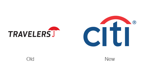
Can you imagine designing a logo in just a few seconds (and 34 years of experience)? Paula Scher did just that in a client meeting with then named Travelers group insurance. The company was re-branding but wanted to maintain their distinctive umbrella symbol. This logo is simple and brilliant in the way it combines a simplified version of an umbrella and simplified type. Designed byPentagram.
Delta Airlines
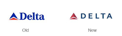
More of a realign than a redesign – this new delta logo is sharp! The colors in the new logo are more subdued and the choice of a all caps sans serif typeface makes the logo feel more modern. The new symbol also has a nice dimensional aspect to it without getting into cheesy 3d effects. Designed by Lippincott Mercer.
BP
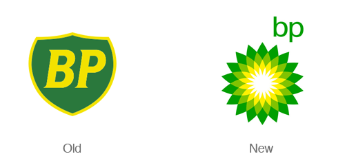
The BP logo redesign takes a boring, static shield with initials and transforms it into a bright, colorful clean flower. This logo is an attempt to move the company in a completely new direction (or just reflect that in the image). Designed by Landor.
Chad 2010
Spartan
DesignTent
Pepperhorn
GreenLabs

Airtistic
Ecotaste

