Charts and graphs are present on various types of sites in order to improve the user experience and show in a easier and more likeable way data for the visitors.
FusionCharts Suite XT
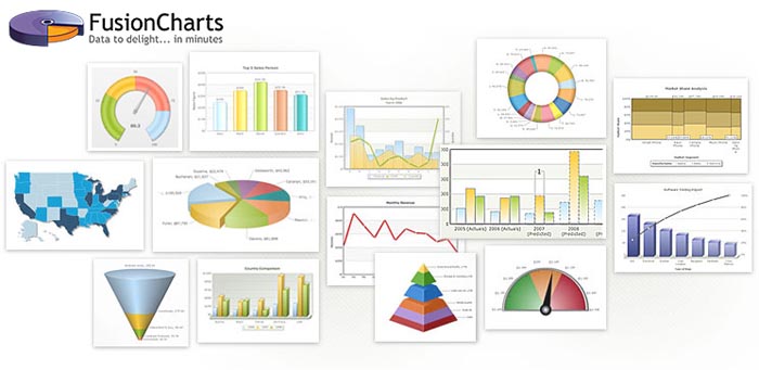
FusionCharts Suite XT is a JavaScript/HTML5 charting library with 90+ chart types, 965 data-driven maps, and readymade dashboards that work across all devices and platforms including IE6. It accepts both XML & JSON data formats and can be easily integrated with any JavaScript framework or a server-side technology e.g., ASP.NET, PHP, Java, etc. It comes with the most advanced charting features like tooltips, interactive legend, drill-downs, zooming and scrolling, visual selection and editing of data, multi-format chart export, and lots more.
You can easily install it (copying/pasting some folders and files) and create your first chart in under 15 minutes using their documentation and readymade demos.
AwesomeChartJS
AwesomeChartJS is a simple Javascript library that can be used to create charts based on the HTML 5 canvas element.
The main goal during development was to pick sane defaults in order to let the user create simple charts quickly with just a couple of lines of code.
One can create at almost no time bar, pie, doughnut and Pareto charts.
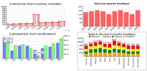
jqBarGraph
jqBarGraph is a jQuery plugin that gives you freedom to easily display your data as graphs. There are three types of graphs: simple, multi and stacked. All you have to do is to pass your data to this plugin. This plugin is compatible and fully tested with Safari 2+, Internet Explorer 6+, Firefox 2+, Google Chrome 3+, Opera 9+.
Of course, there are a lot of settings to tune appearance of your graph, as are animation, color scheme, dimensions etc. Also, you can additionally change look and feel of graph via CSS.
Visifire
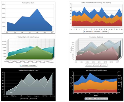
Visifire is a set of data visualization controls – powered by Microsoft Silverlight & WPF. Visifire is a multi-targeting control which can be used in both WPF & Silverlight applications. Use the same API to create charts & gauges in Mobile, Web & Desktop environments. Visifire Silverlight Controls can also be embedded in any webpage as a standalone Silverlight App. Visifire is independent of server side technology. It can be used with ASP, ASP.Net, SharePoint, PHP, JSP, ColdFusion, Python, Ruby or just simple HTML.
Arborjs
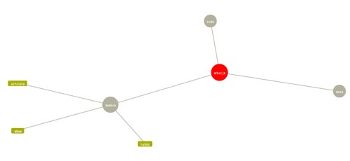
Arbor is a graph visualization library built with web workers and jQuery. Rather than trying to be an all-encompassing framework, arbor provides an efficient, force-directed layout algorithm plus abstractions for graph organization and screen refresh handling.
It leaves the actual screen-drawing to you. This means you can use it with canvas, SVG, or even positioned HTML elements; whatever display approach is appropriate for your project and your performance needs.
As a result, the code you write with it can be focused on the things that make your project unique – the graph data and your visual style – rather than spending time on the physics math that makes the layouts possible.
HumbleFinance
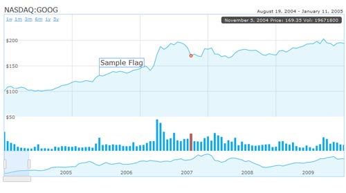
HumbleFinance is an HTML5 data visualization tool written as a demonstration of interactive graphing in HTML5. It is similar to the Flash tool on finance.google.com. The tool itself is written entirely in JavaScript, using the Prototype and Flotr libraries. It can be used to display any two 2-D data sets of real numerical data which share an axis.
RGraph
RGraph is a HTML5 canvas graph library. It uses features that became available in HTML5 (specifically, the CANVAS tag) to produce a wide variety of graph types: bar chart, bi-polar chart (also known as an age frequency chart), donut chart, funnel chart, gantt chart, horizontal bar chart, LED display, line chart, meter, odometer, pie chart, progress bar, rose chart, scatter graph and traditional radar chart
mooBarGraph
mooBarGraph is AJAX graph plugin for MooTools which support two types of graphs, simple bar and stacked bar graph. This plugin made graph from your JSON data and is compatible with all major browsers including IE6.
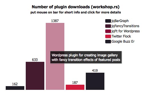
This is jqBarGraph on steroids. It has almost all jqBarGraph possibility, plus some new features, like url bars, info boxes, negative values, AJAX data loading…
gRaphaël
gRaphaël’s goal is to help you create stunning charts on your website. It is based on Raphaël graphics library. Check out the demos to see static and interactive charts in action.
gRaphaël currently supports Firefox 3.0+, Safari 3.0+, Opera 9.5+ and Internet Explorer 6.0+.
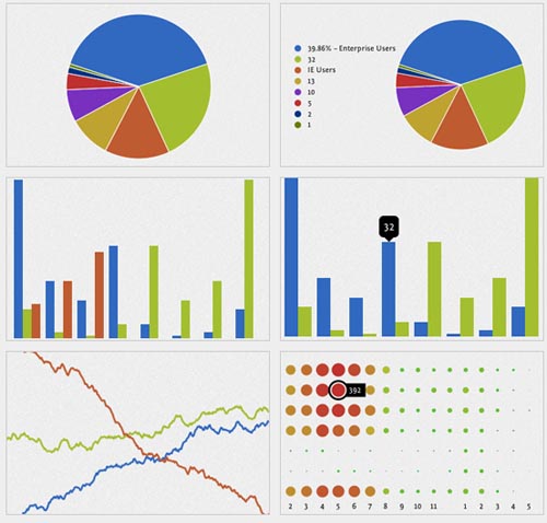
canvasXpress
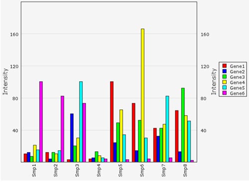
CanvasXpress is a javascript library based on the < canvas > tag implemented in HTML5. I developed this library as the core visualization component for our BMS systems biology platform.
The basic idea was to have generic and simple way to display genomics data. CanvasXpress supports bar graphs, line graphs, bar-line combination graphs, boxplots, dotplots, area graphs, stacked graphs, percentage-stacked graphs, heatmaps, heatmaps, 2D-scatter plots, 2D-scatter bubble plots, 3D-scatter plots, pie charts, correlation plots, Venn diagrams, networks (or pathways), candlesticks plots and genome browser.
It also supports a few data transformations like log and exponential transformation, z-score, percentile transformation, ratios and transposing. It also support grouping of samples, hierarchical clustering, kmeans, complex layouts, regression lines, normal distribution plots, non linear fitting, zooming, events … well, there a lot more features but maybe at this time I already capture your attention.
Timeplot from Simile Widgets
Timeplot is a DHTML-based AJAXy widget for plotting time series and overlay time-based events over them (with the same data formats that Timeline supports)
Visualize
The Visualize plugin parses key content elements in a well-structured HTML table, and leverages that native HTML5 canvas drawing ability to transform them into a chart or graph visualization. For example, table row data values serve as chart bars, lines or pie wedges; table headers become value and legend labels; and the title and caption values provide title labels within the image. Visualize also automatically checks for the highest and lowest values in the chart and uses them to calculate x-axis values for line and bar charts. Finally, the plugin includes two different CSS styles — one light and one dark — that can be used as is, or can serve as a starting point to customize chart and graph presentation to match any application style.
Protovis
Protovis composes custom views of data with simple marks such as bars and dots. Unlike low-level graphics libraries that quickly become tedious for visualization, Protovis defines marks through dynamic properties that encode data, allowing inheritance, scales and layouts to simplify construction.
jqPlot
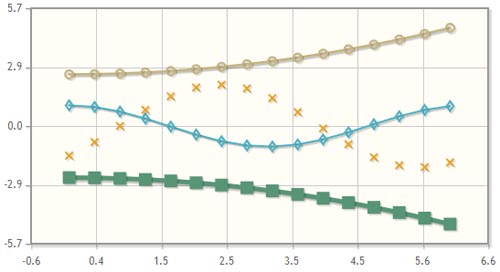
jqPlot is a plotting and charting plugin for the jQuery Javascript framework. jqPlot produces beautiful line, bar and pie charts with many features:
- Numerous chart style options.
- Date axes with customizable formatting.
- Up to 9 Y axes.
- Rotated axis text.
- Automatic trend line computation.
- Tooltips and data point highlighting.
- Sensible defaults for ease of use.
CSS Stacked Bar Graphs
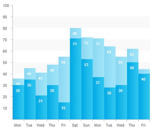
There are plenty of CSS bar graph interpretations, but none of them did stacked bar graphs.